


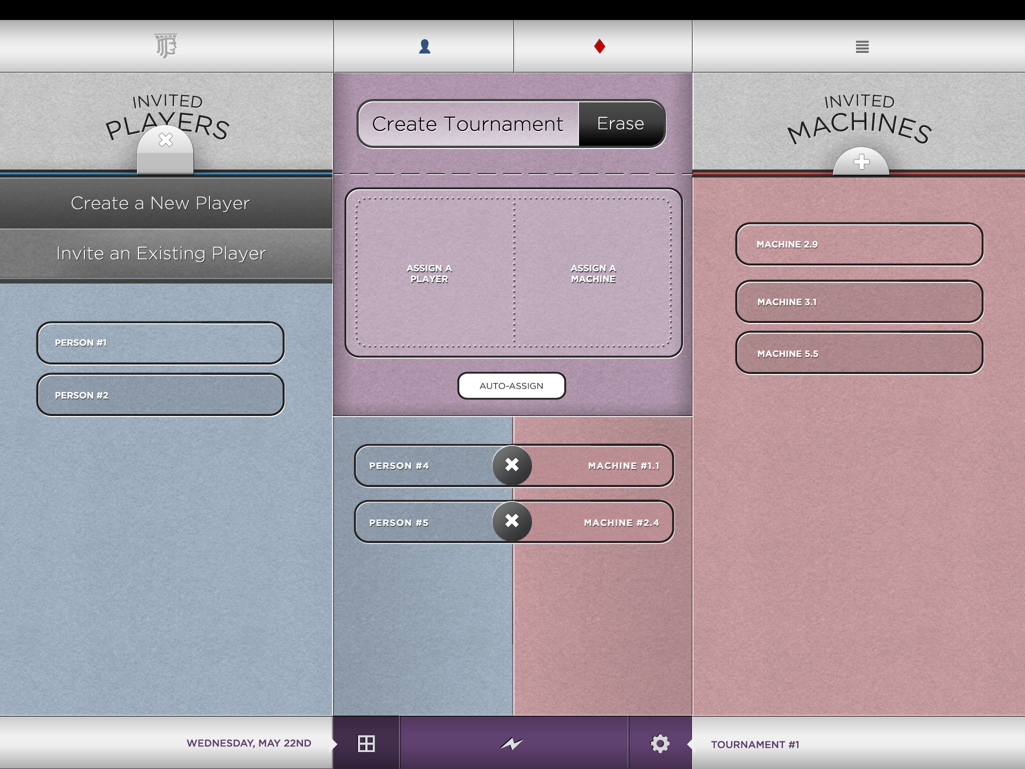
Archive
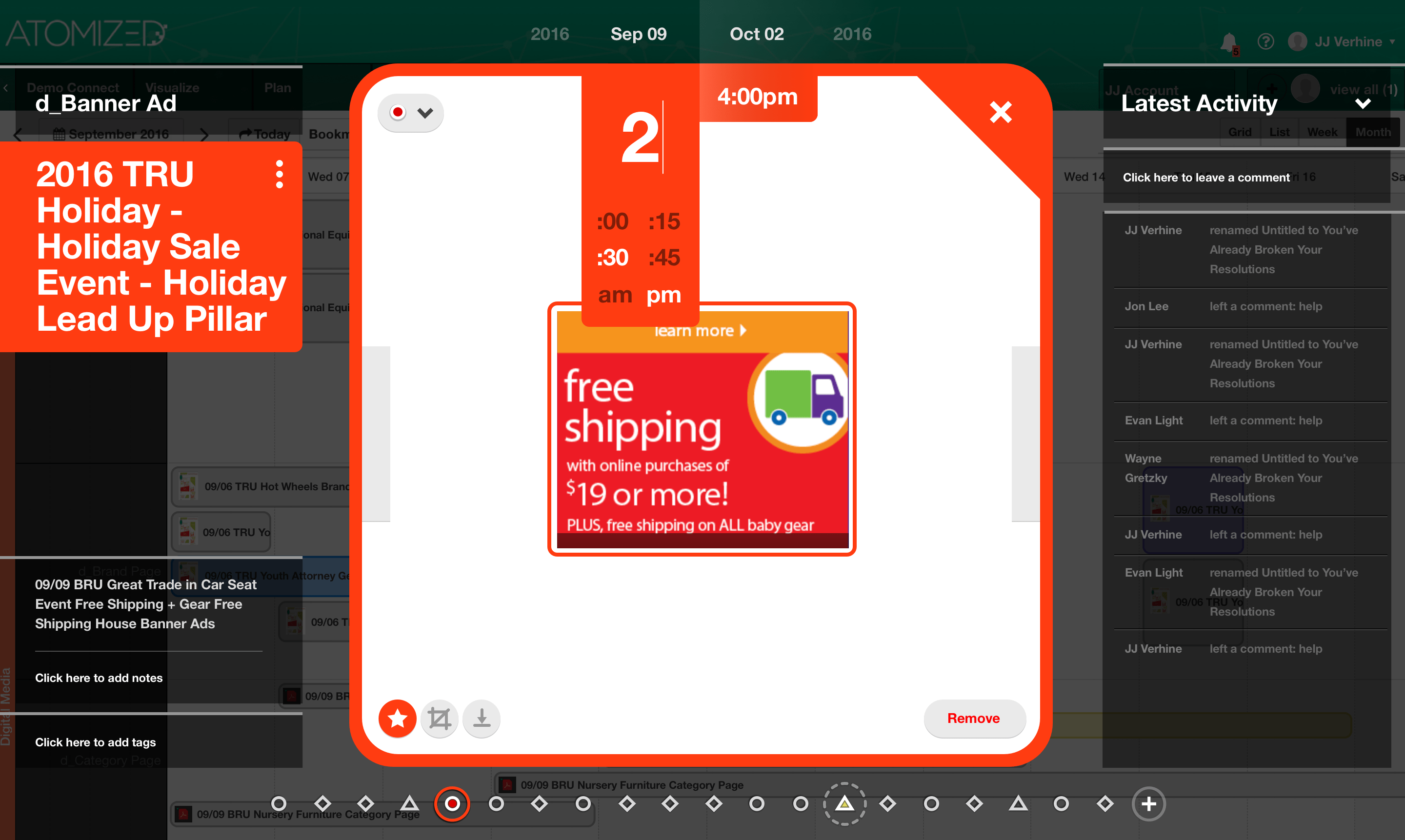
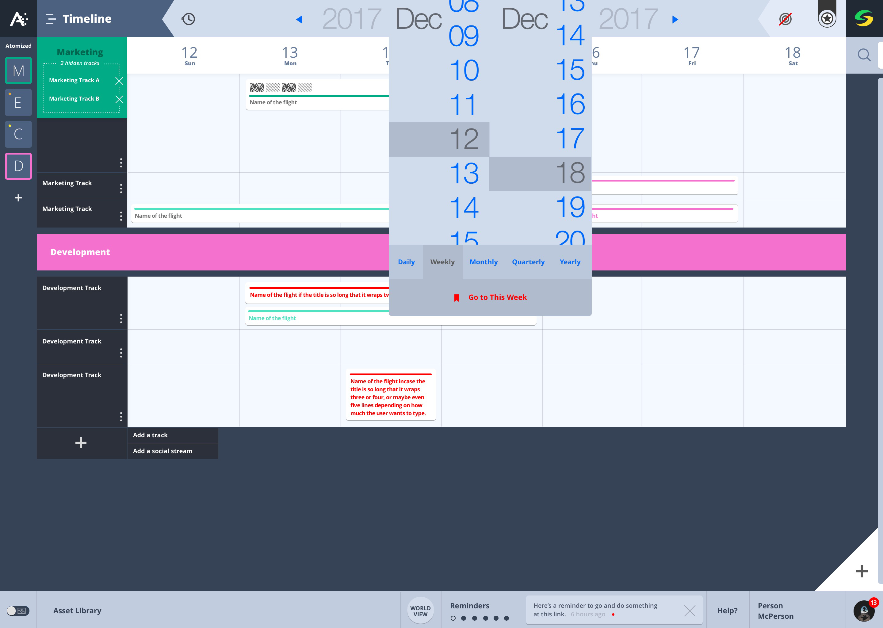
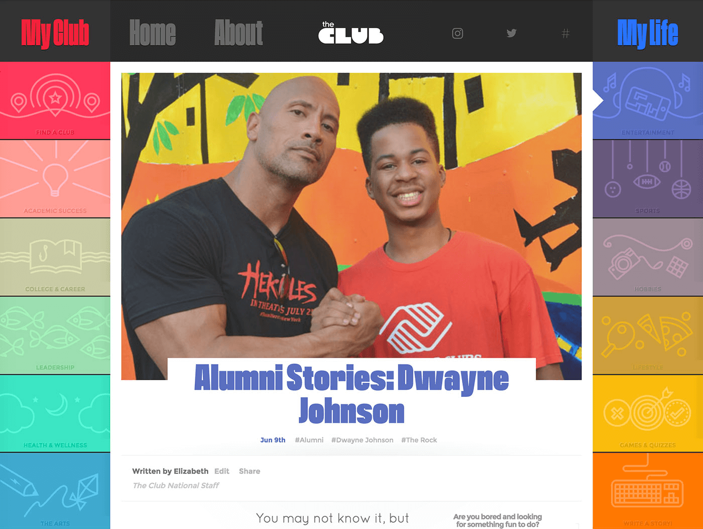
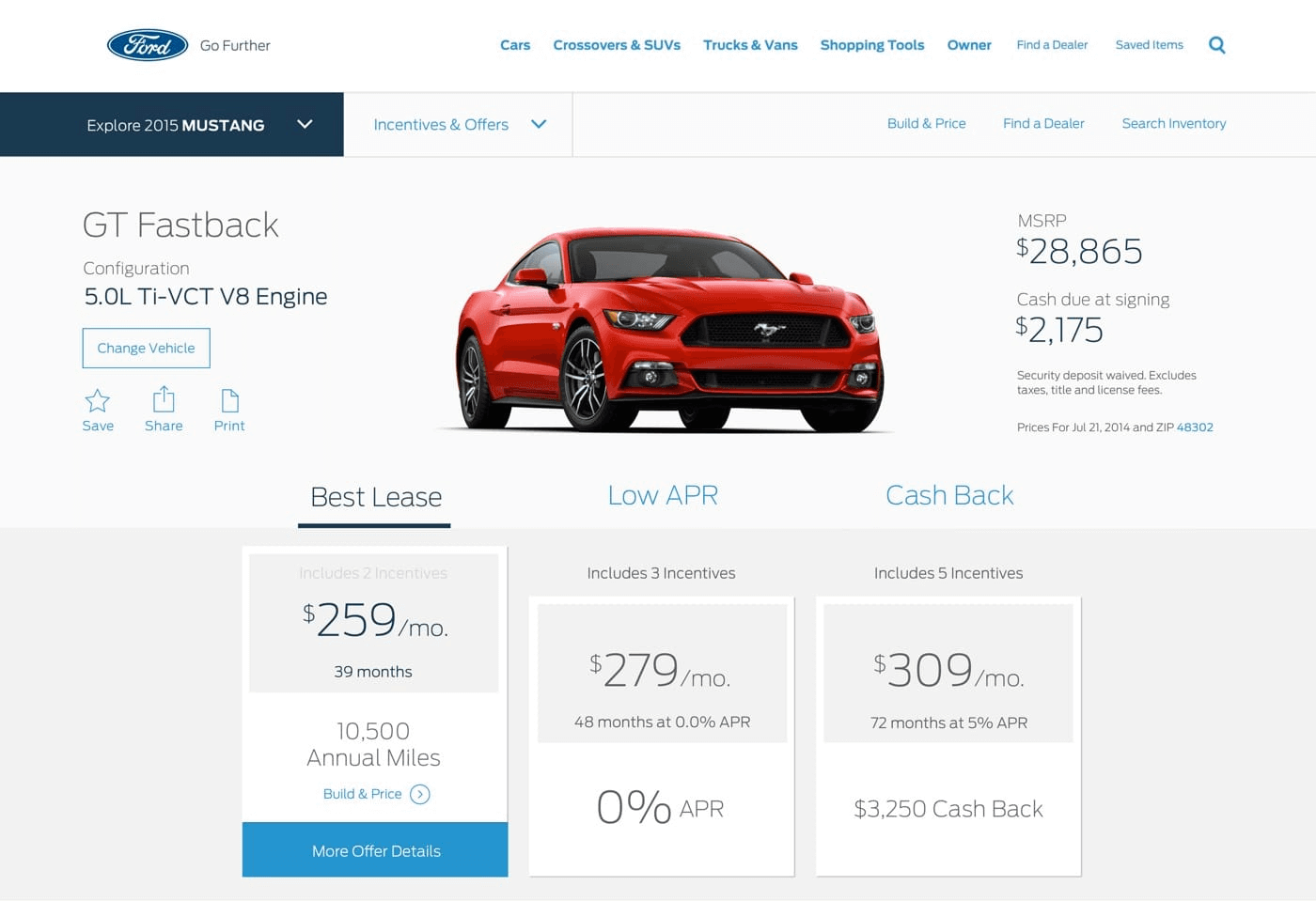
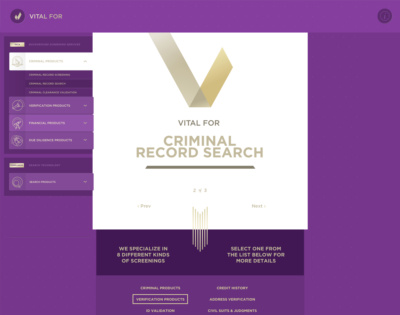
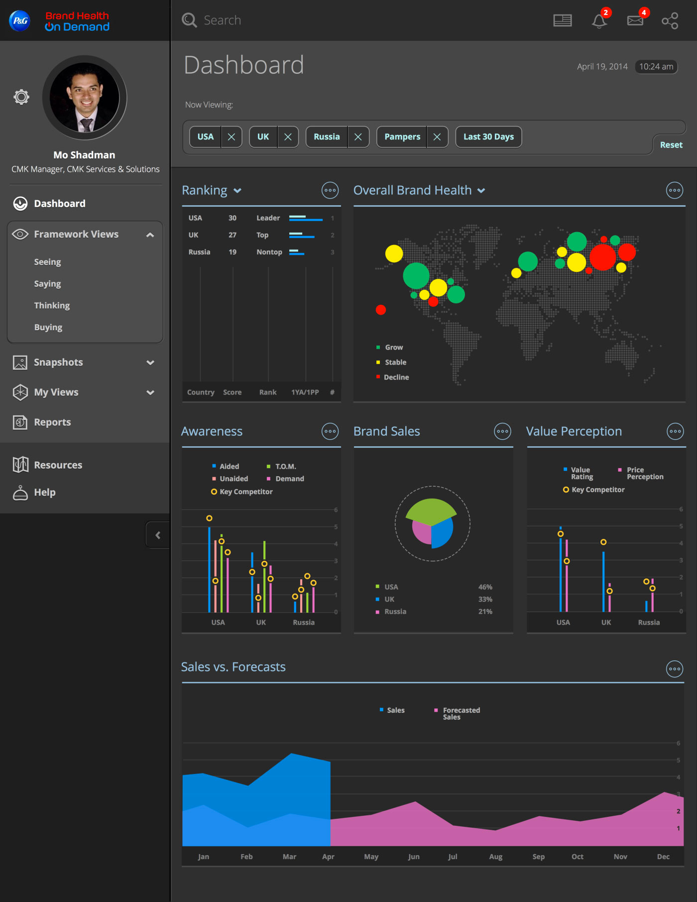
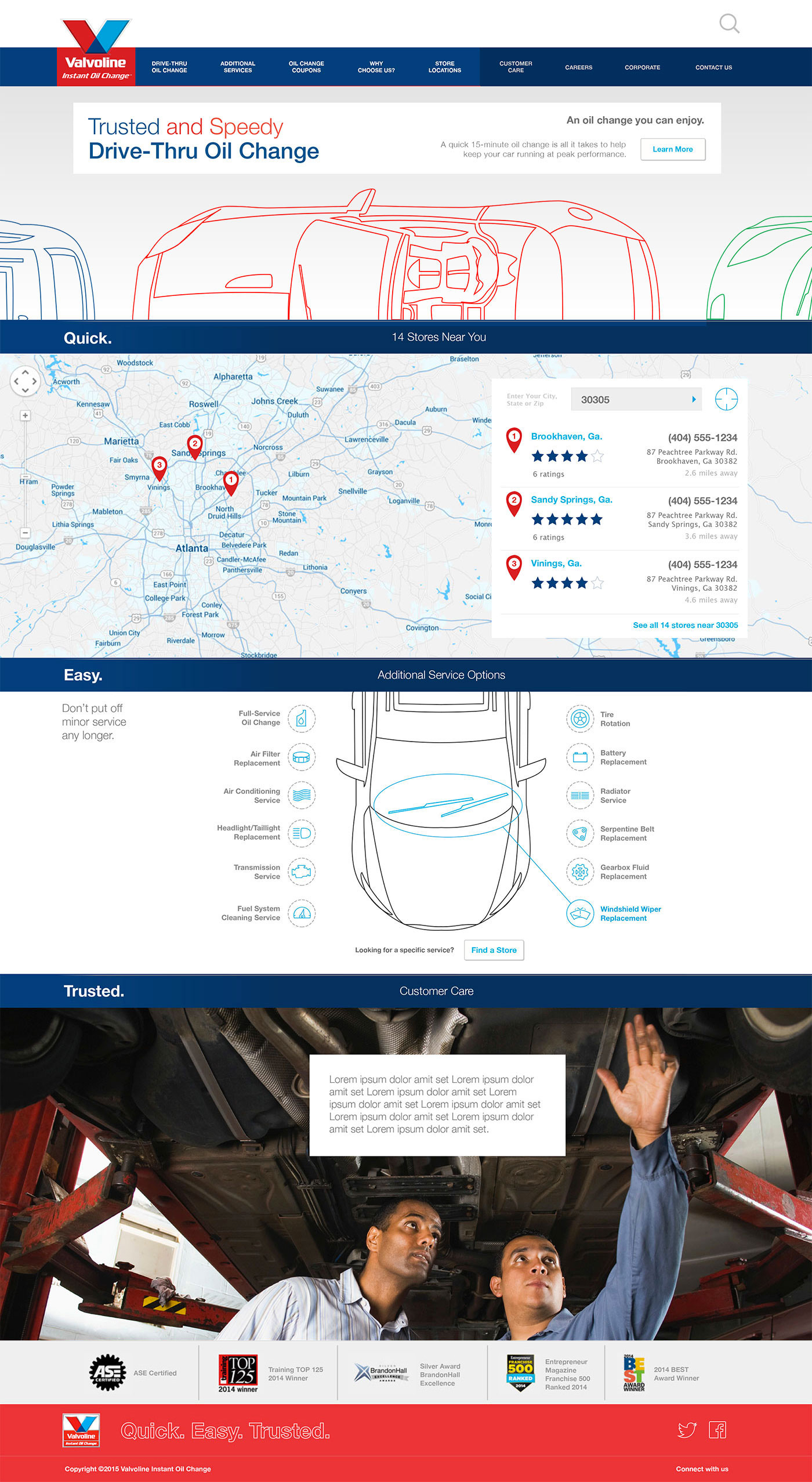
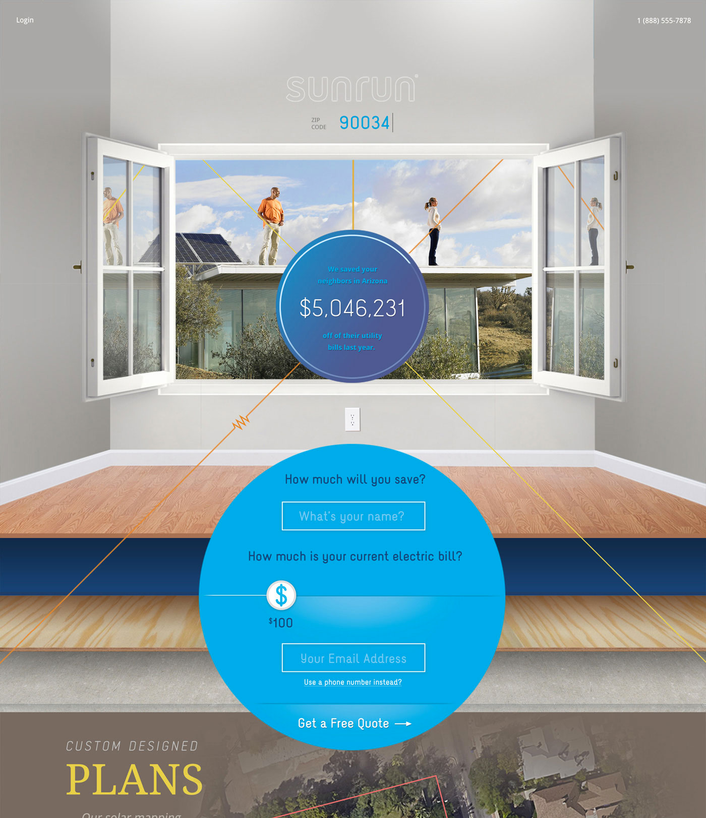
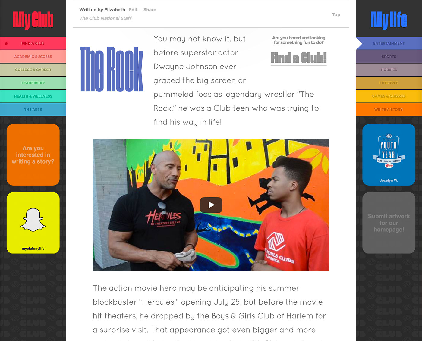
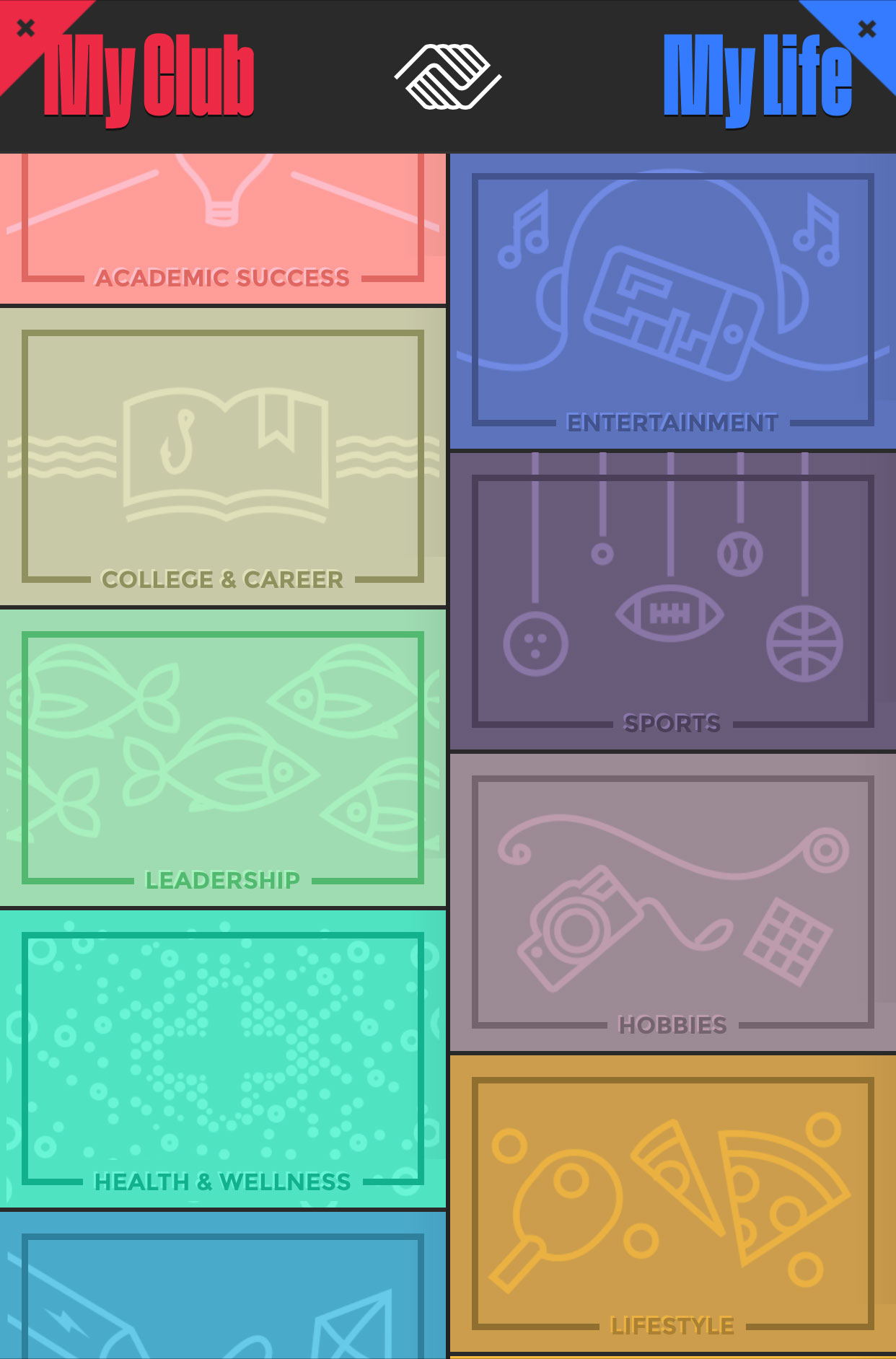
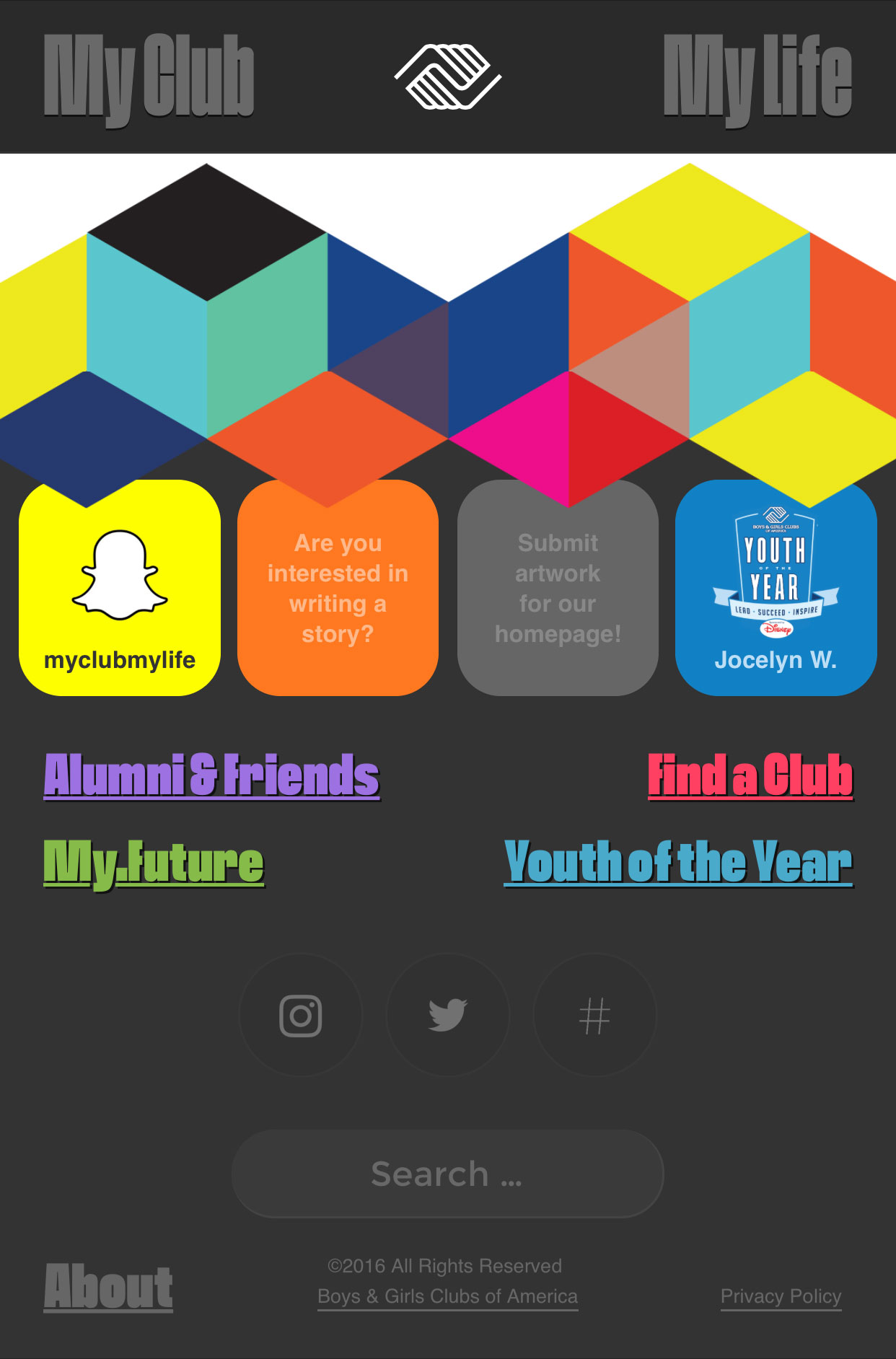
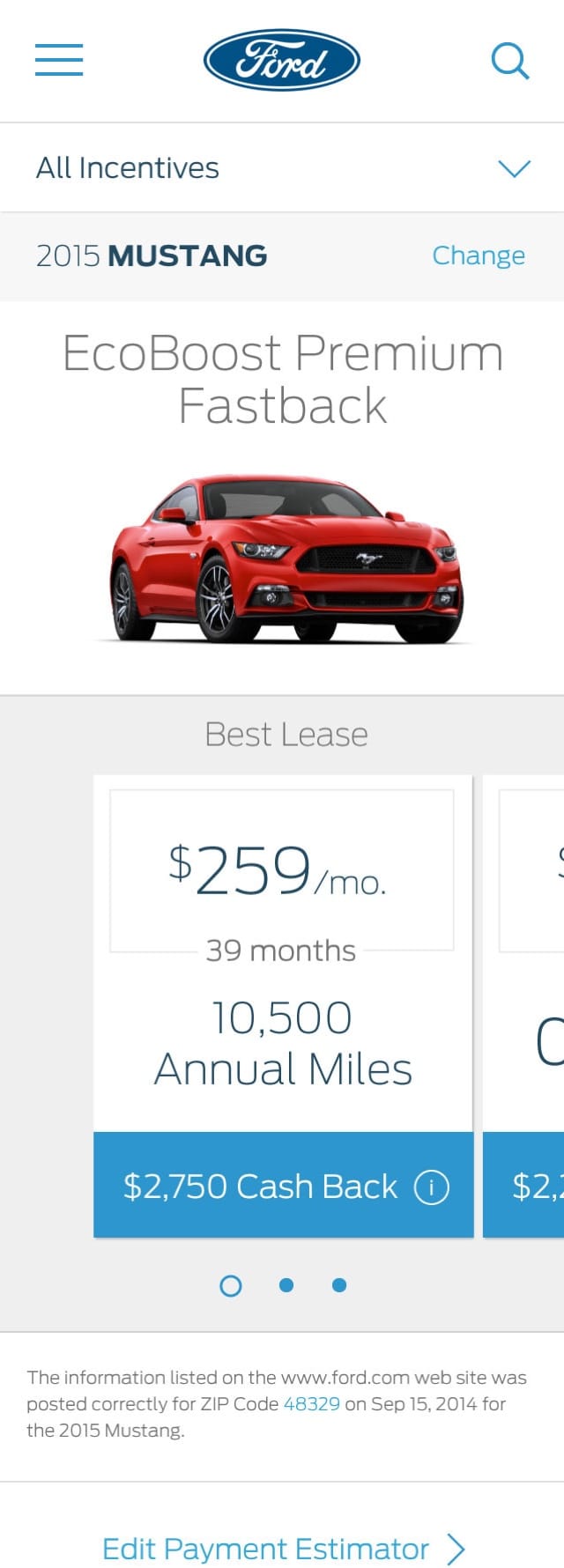
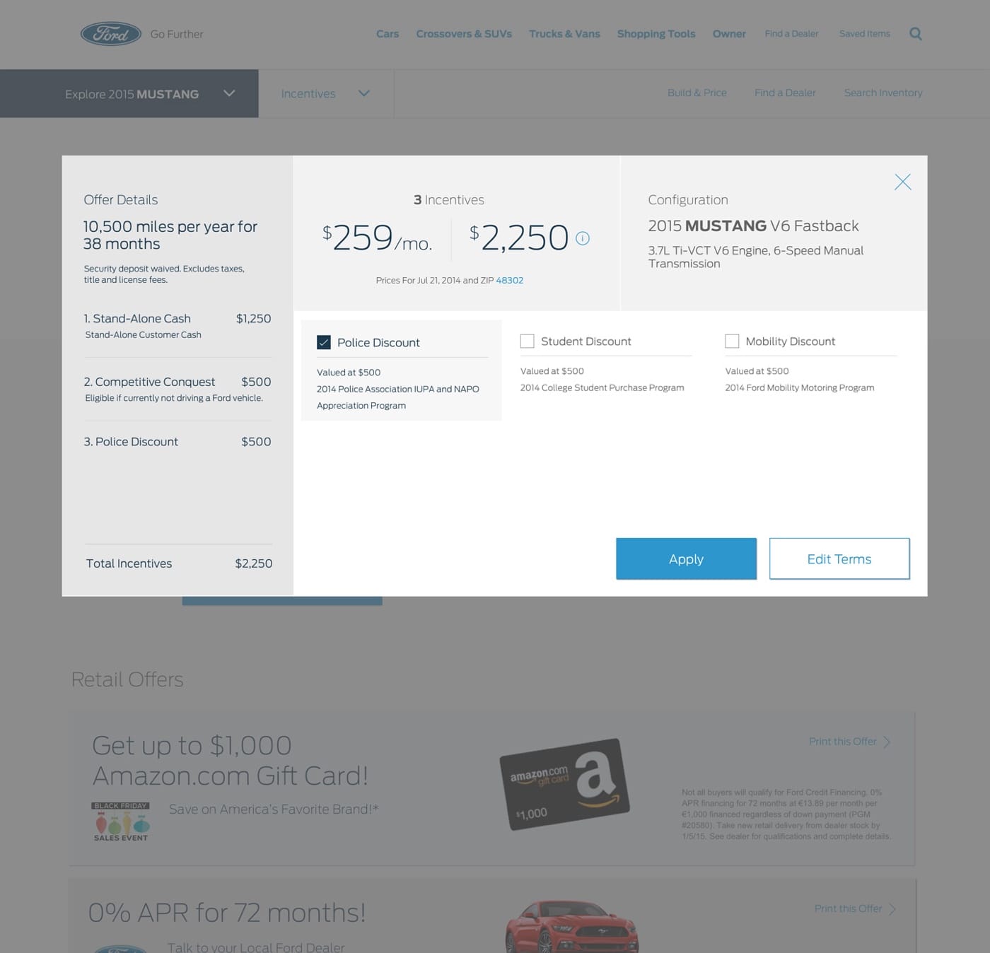
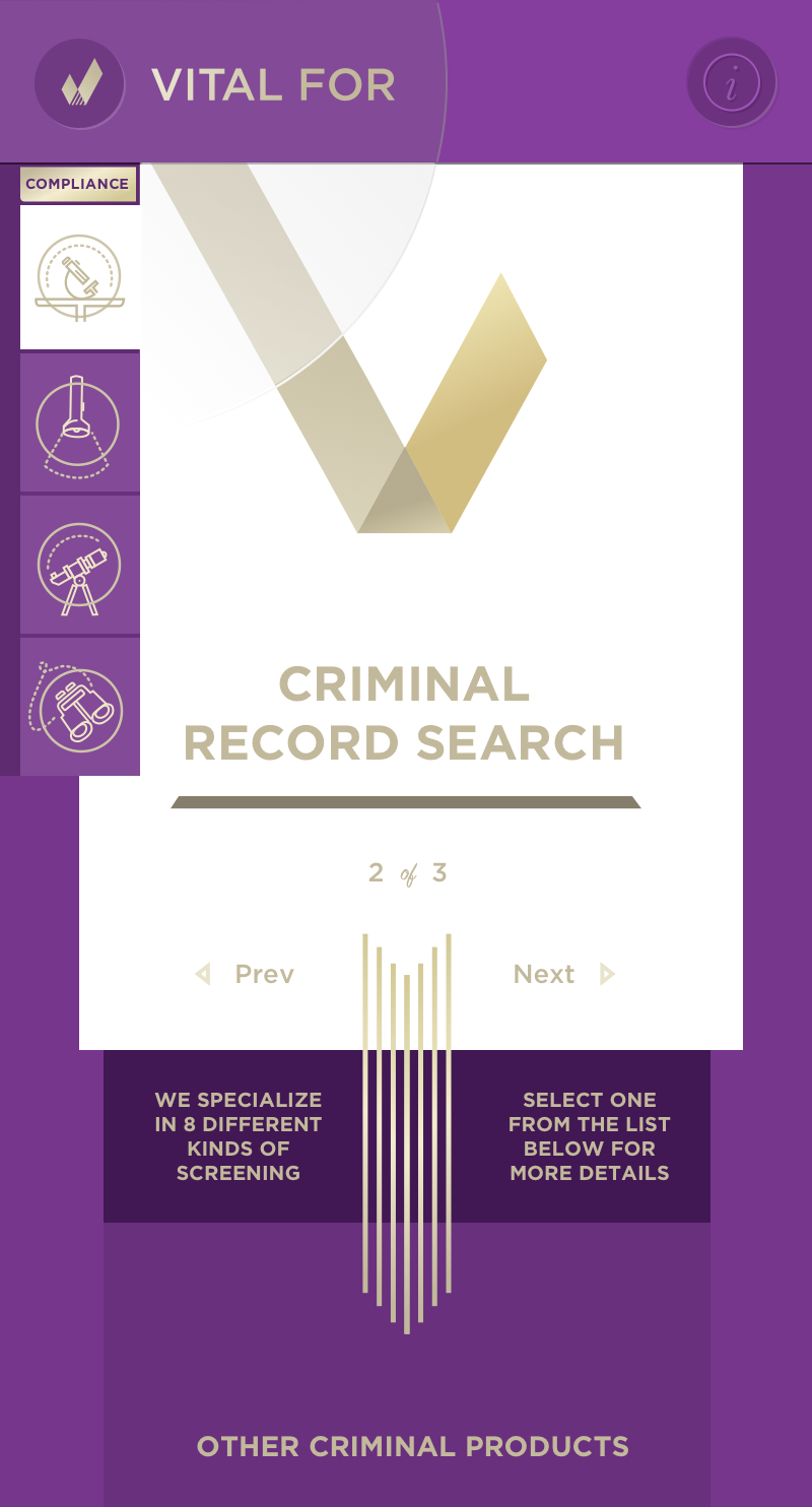
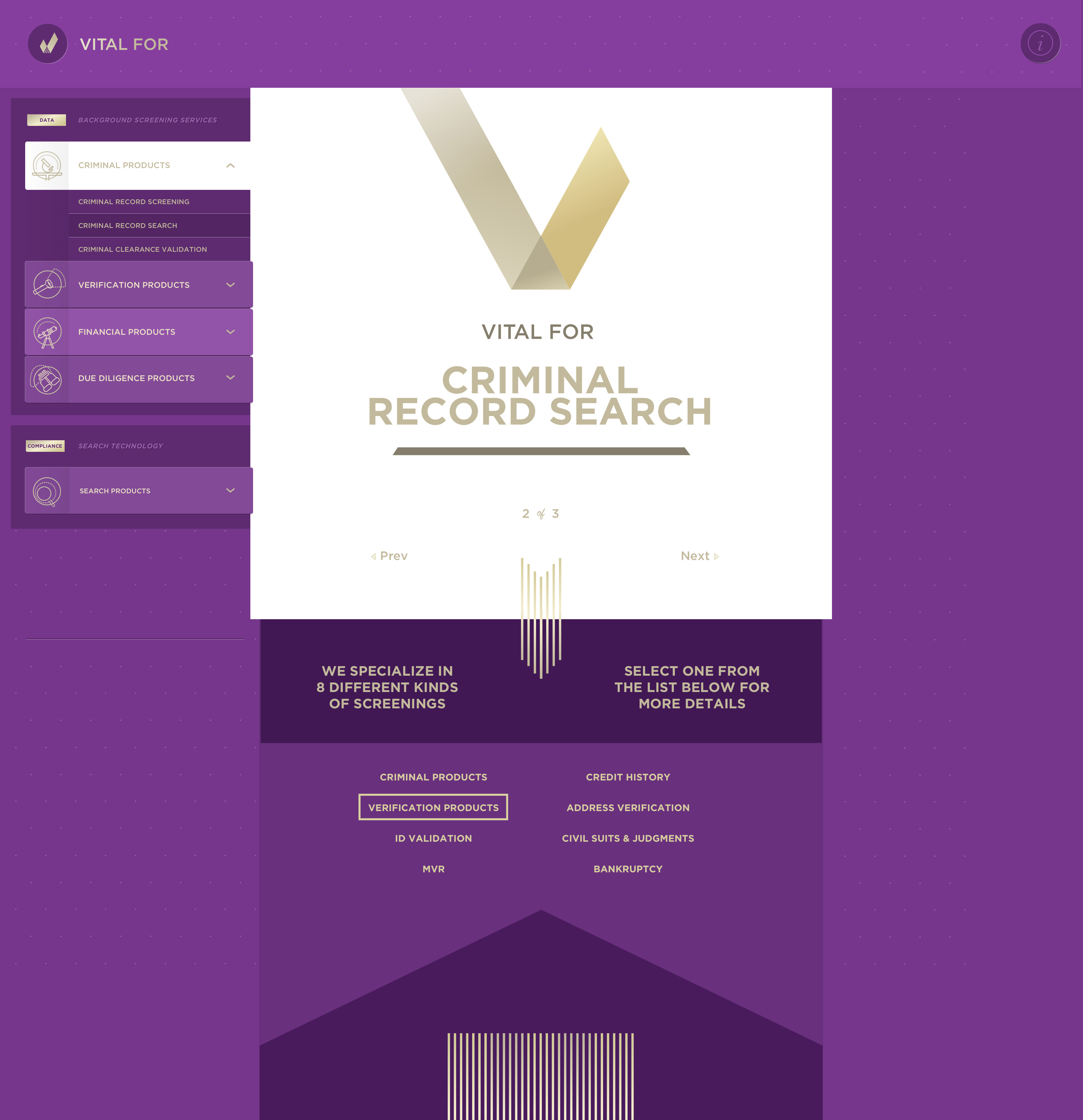
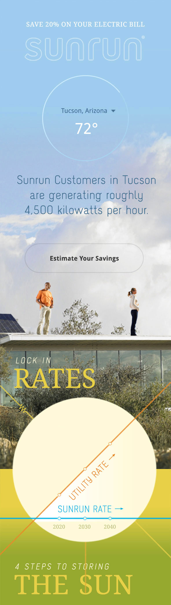
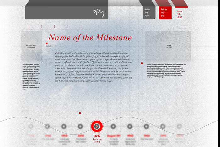
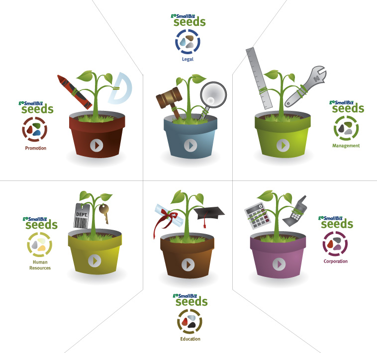
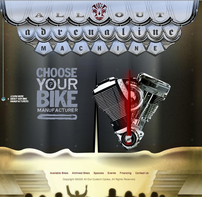
I've previously done work for Data AI, KB Home, Ford, Atomized, P&G, Gap, Boys & Girls Clubs of America, MetroPCS, Valvoline, At-Edge, Green Feather, North American Properties, Coca-Cola, Wrigley/MARS, Sunrun, Walmart, Publix, Cadillac Jack, Equifax, IHG, Gap, MetLife and Reynolds Plantation, ForeverHome, Turner Sports, Ogilvy & Mather, Artistry, Windmark Recording, GoSmallBiz, Tarkenton Financial, Finestone & Morris, Who's Next, All Out Custom Cycles.
Or, browse random screens.

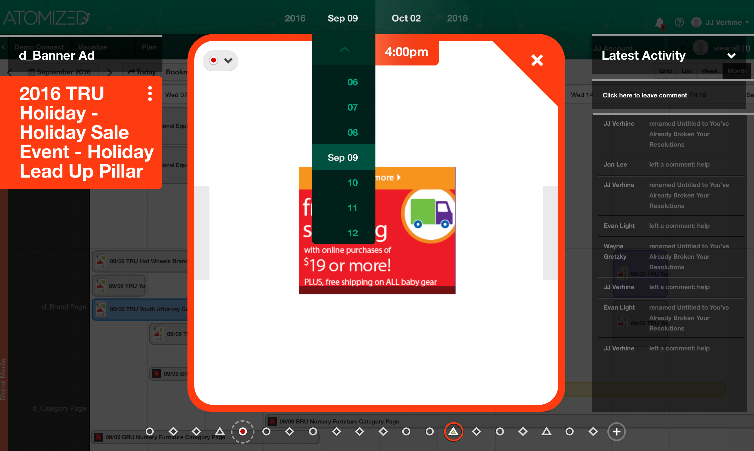
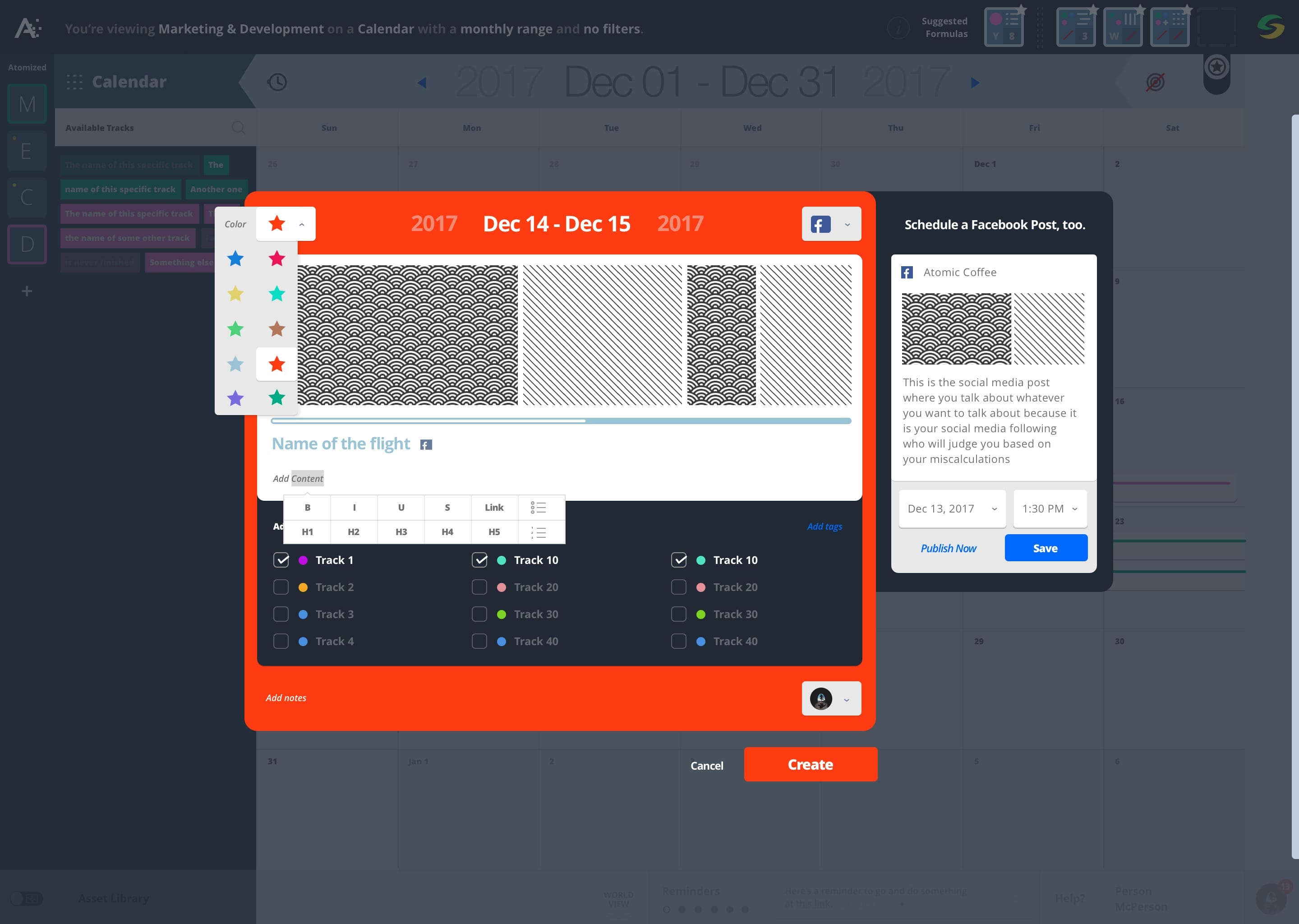
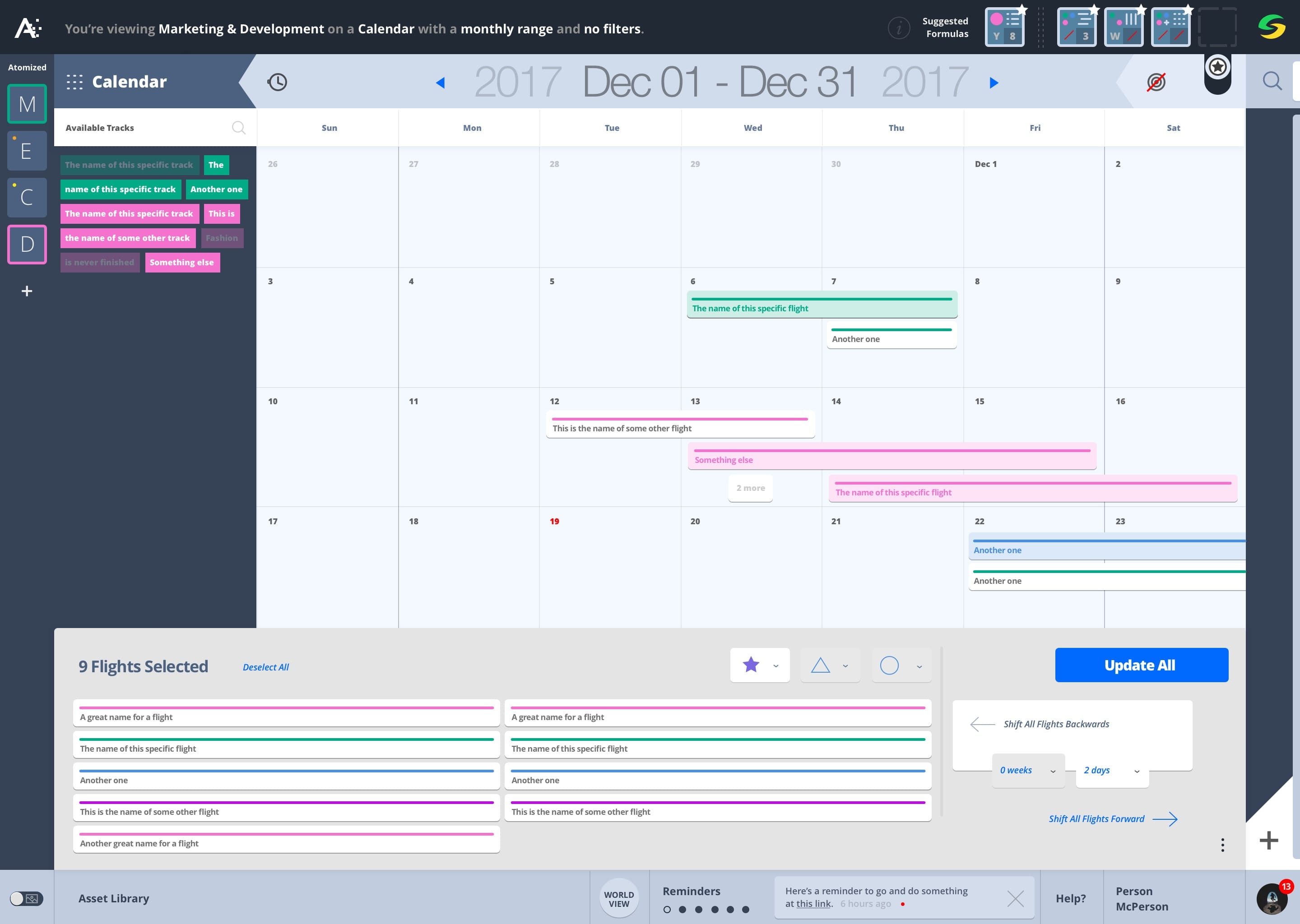
2017


2014


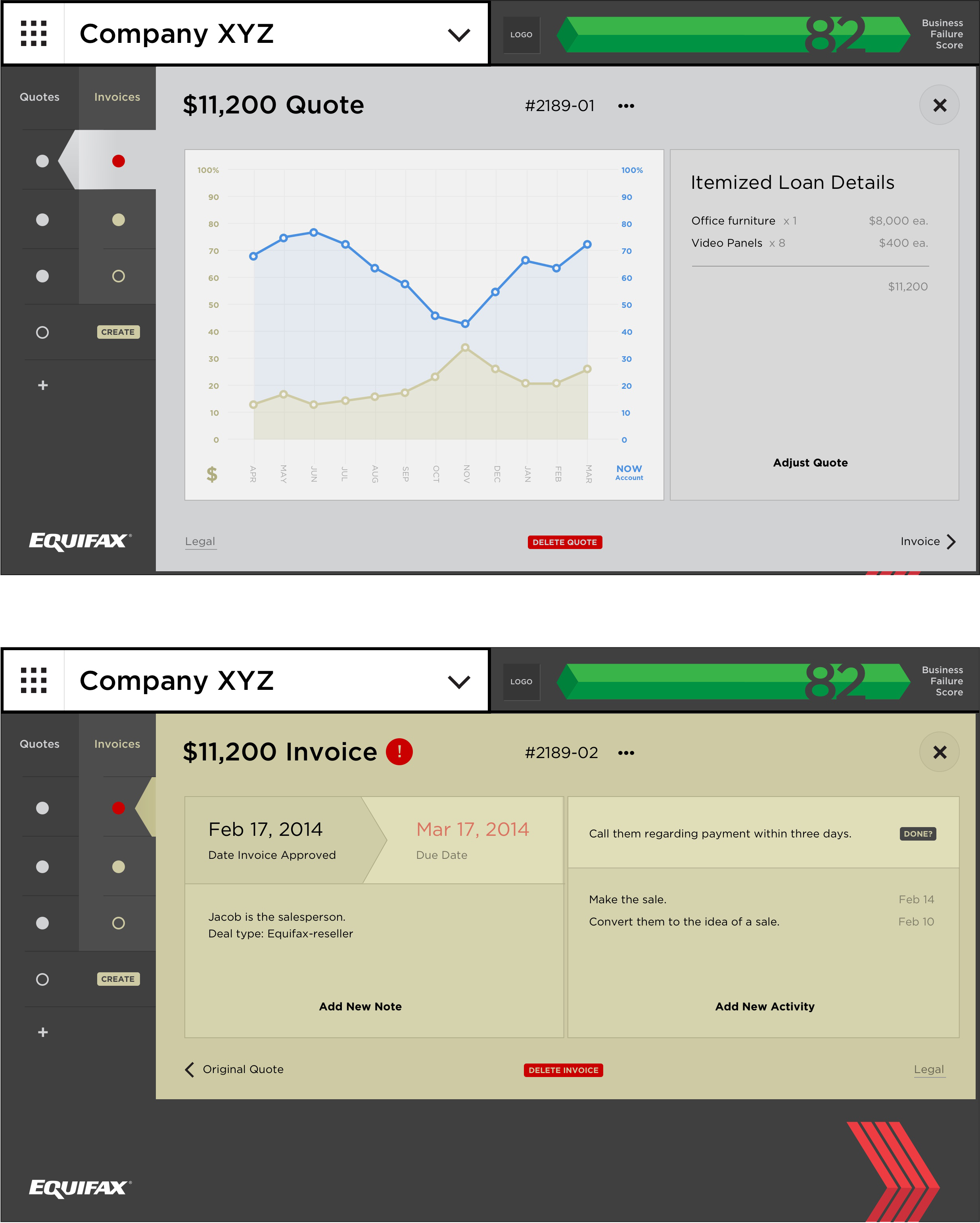
2009
2005