I'm a UX Designer/Developer Hybrid currently looking for a new role in Dallas or Austin, but would jump at the right opportunity in LA or NYC. Call or text me directly (757) 342-5654.
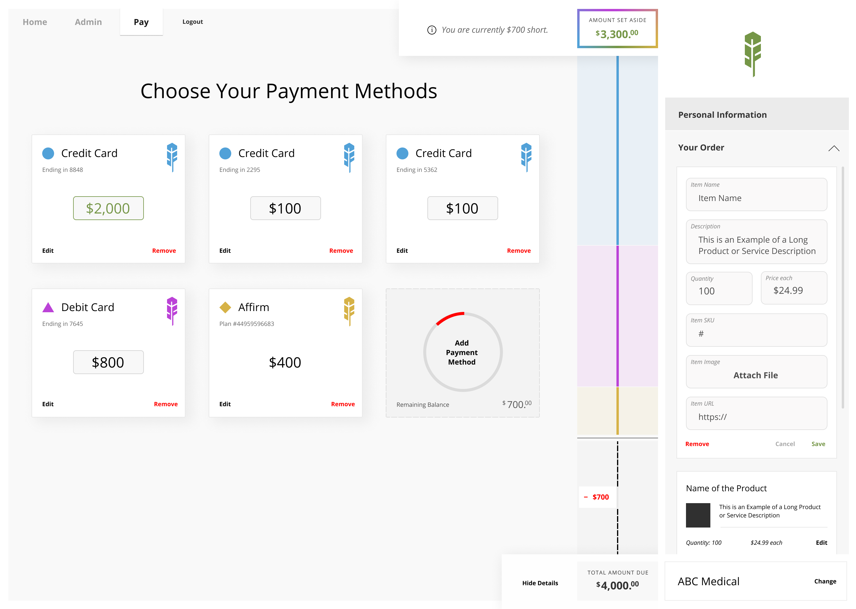
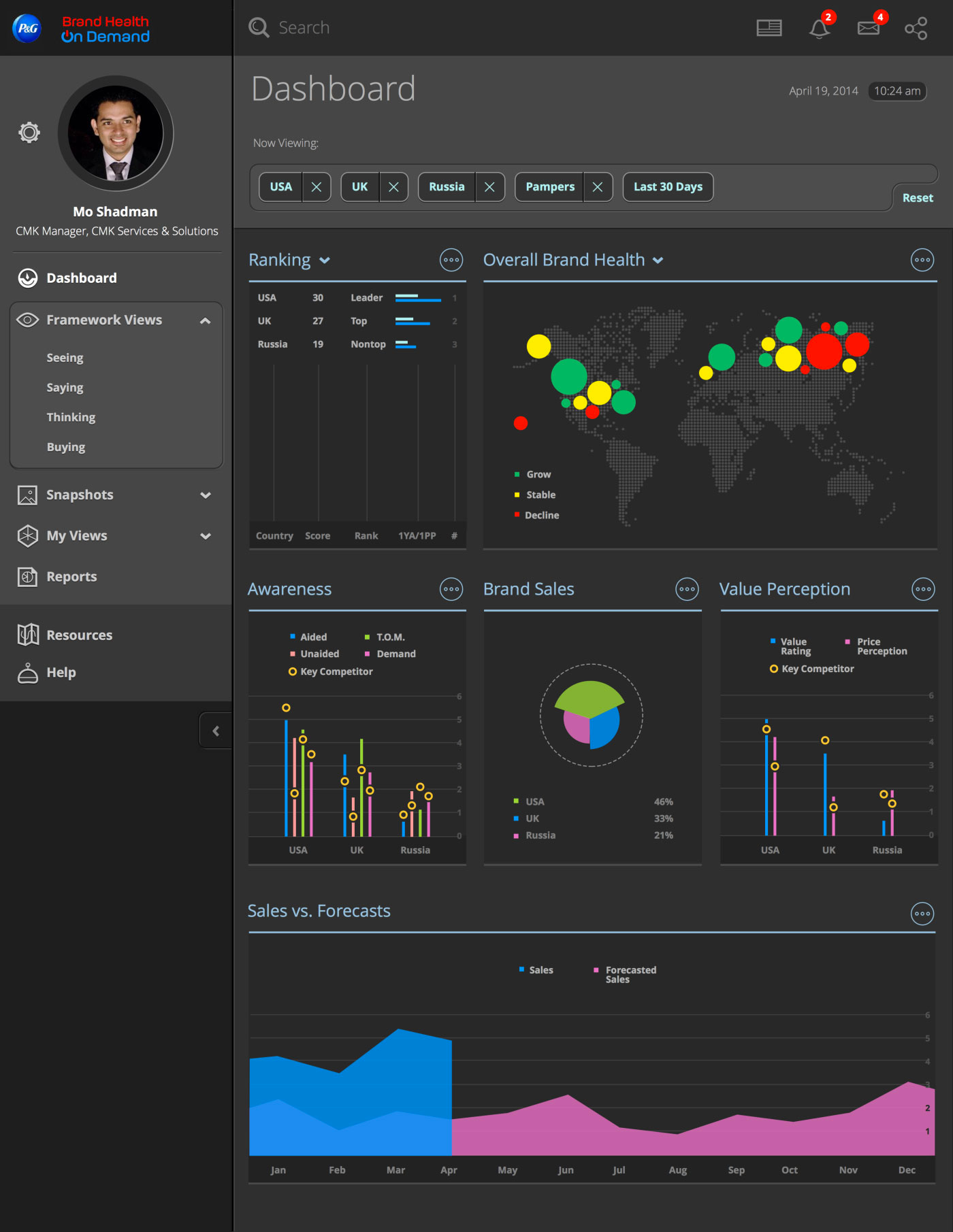
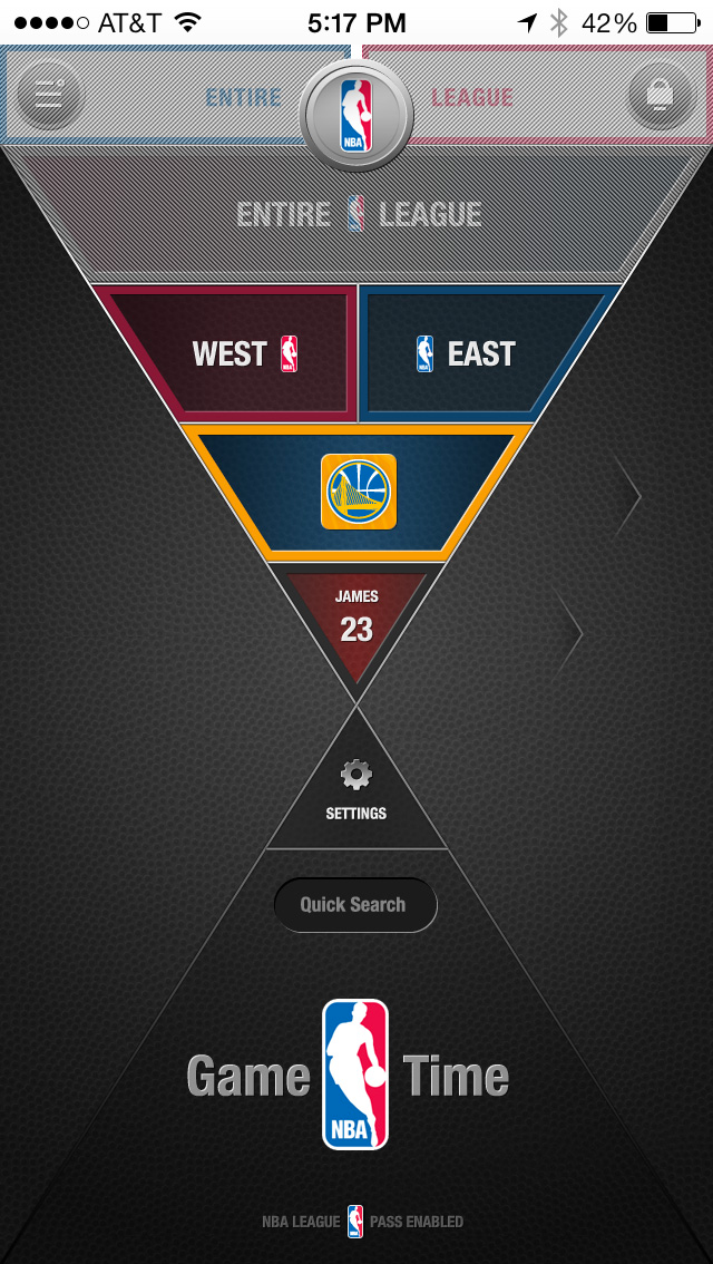
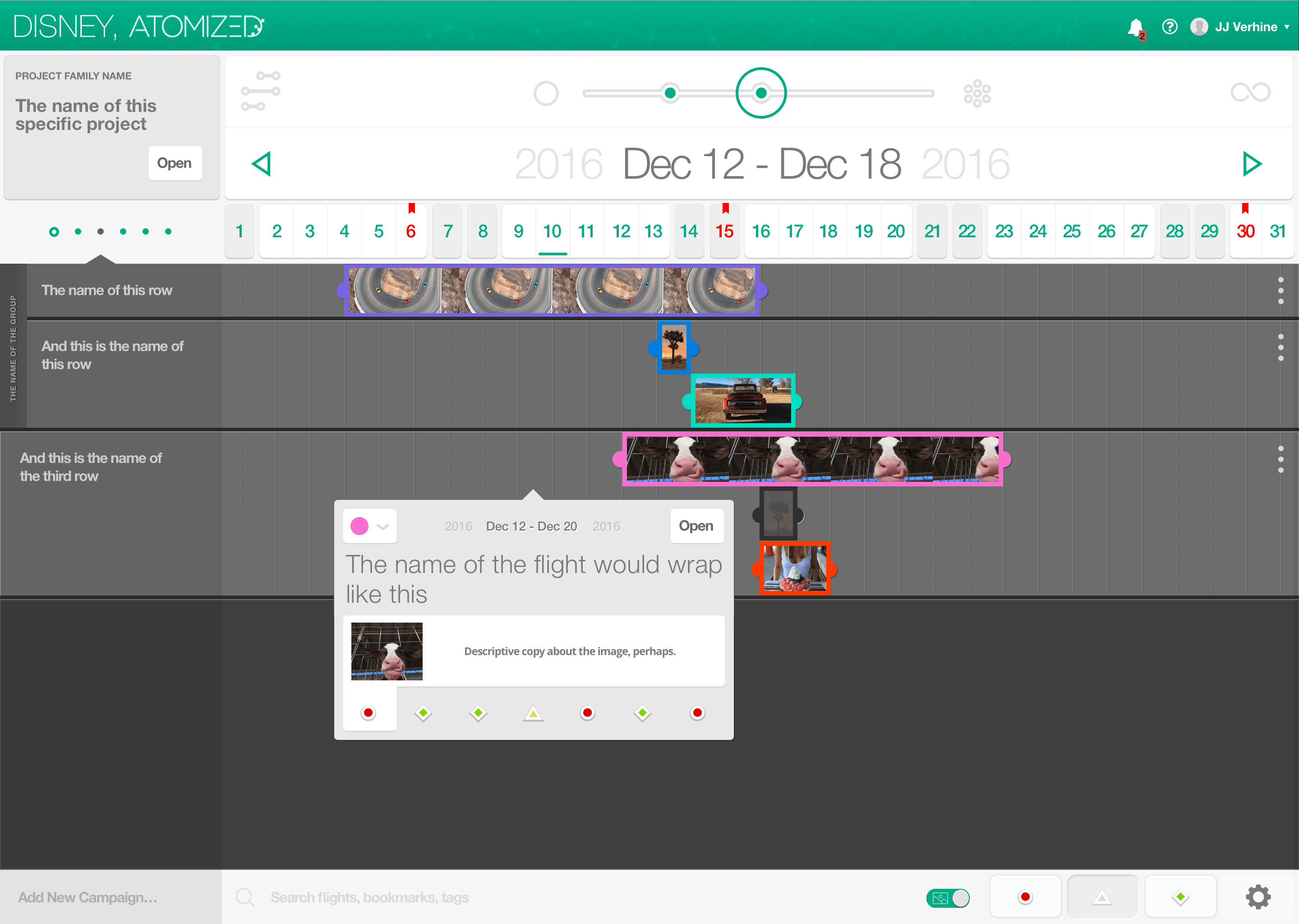
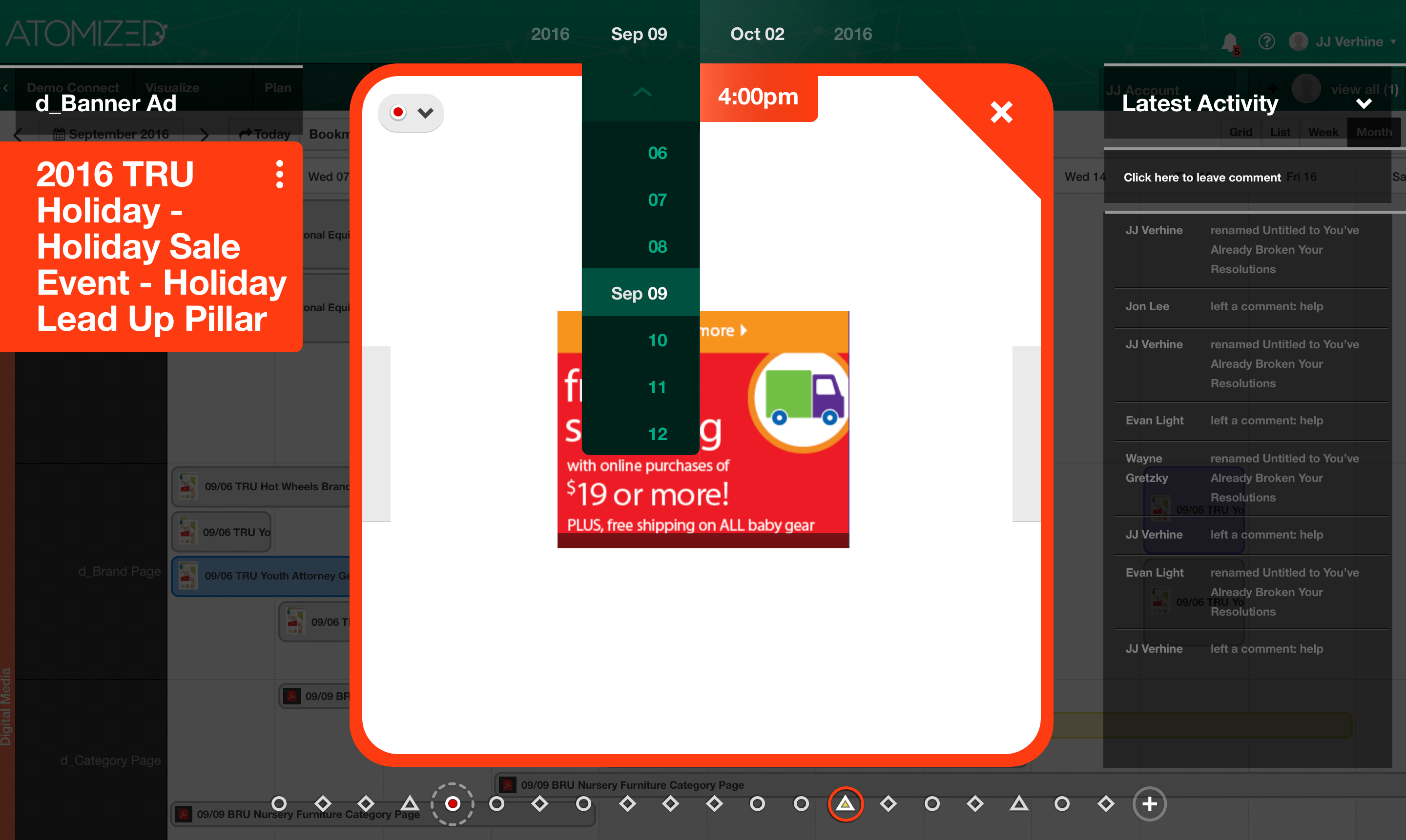
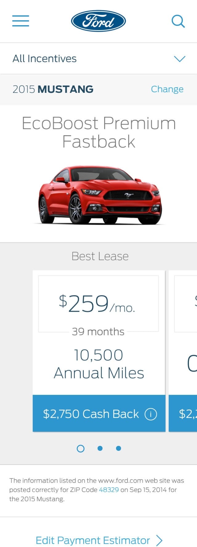
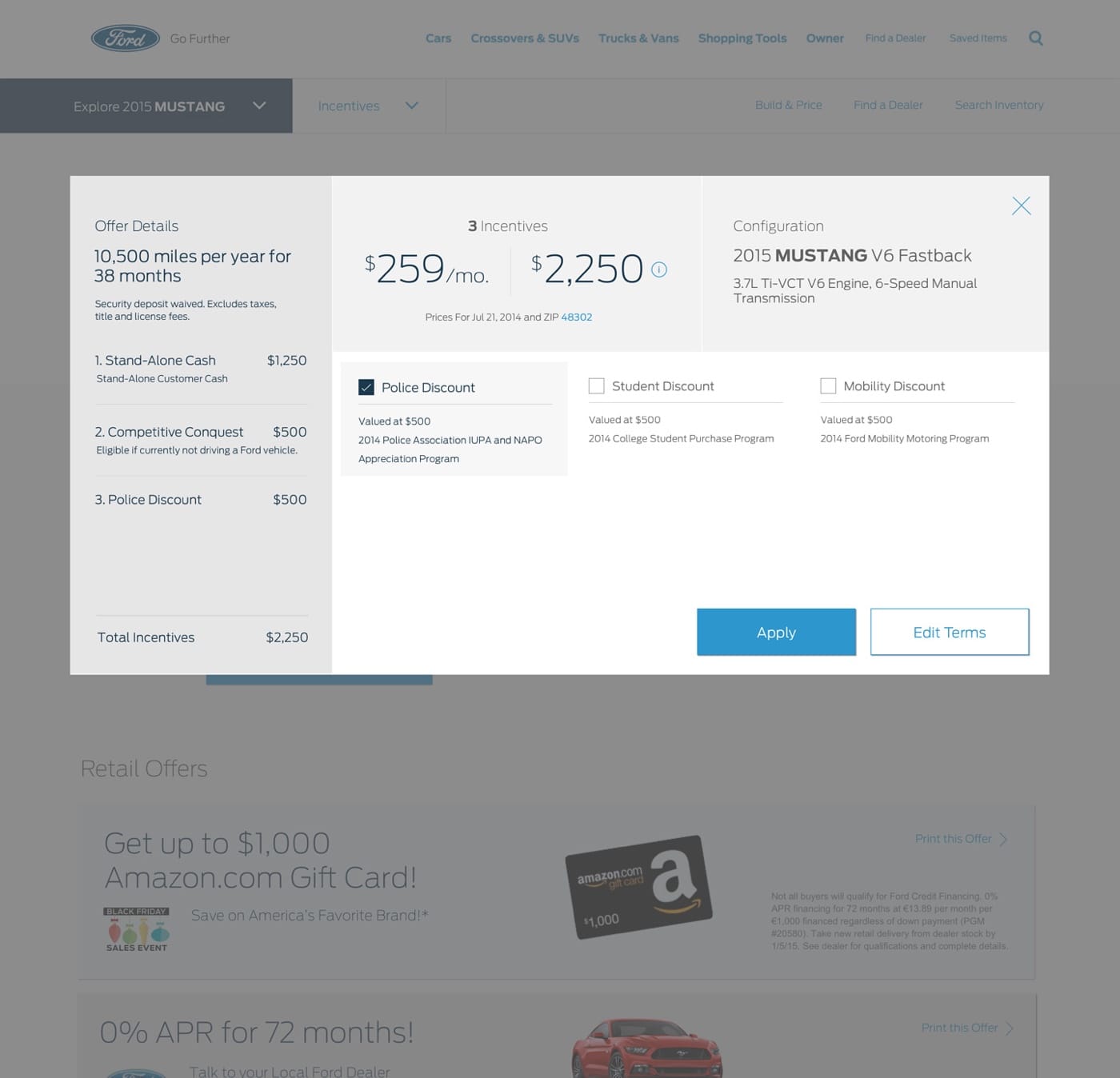
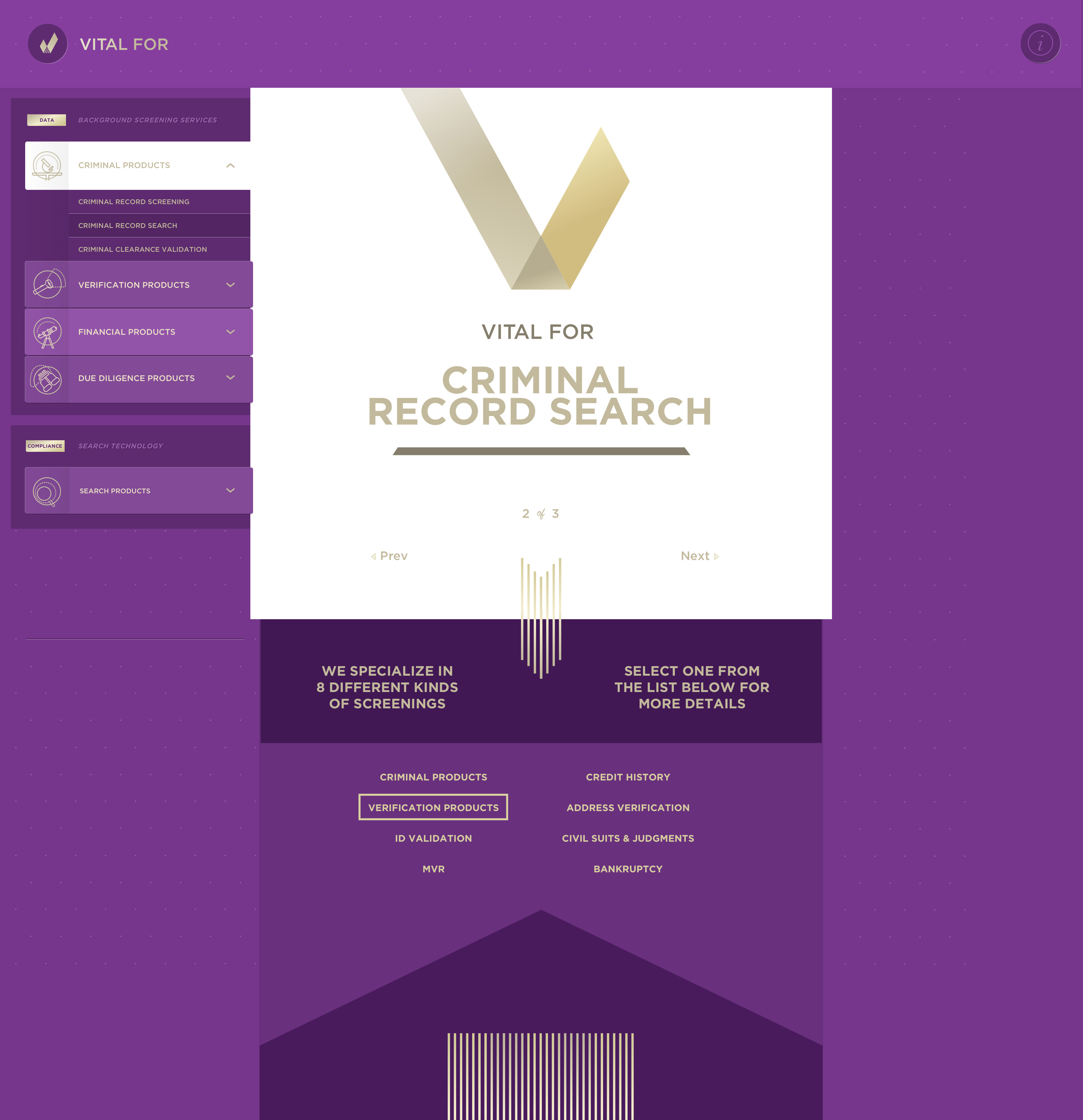
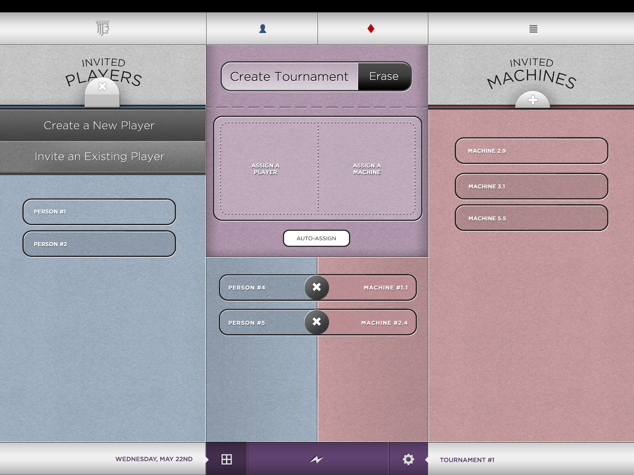
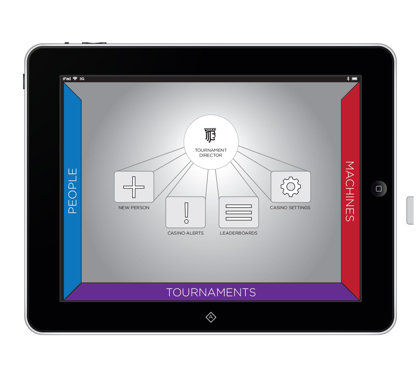
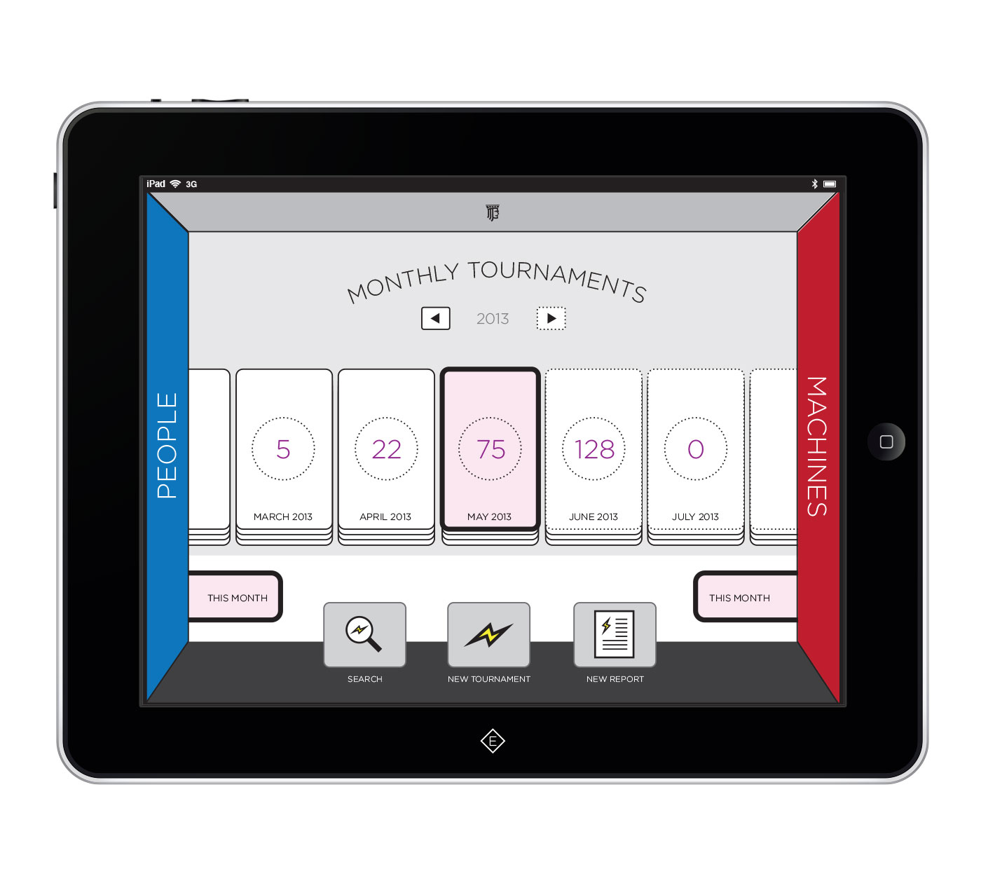
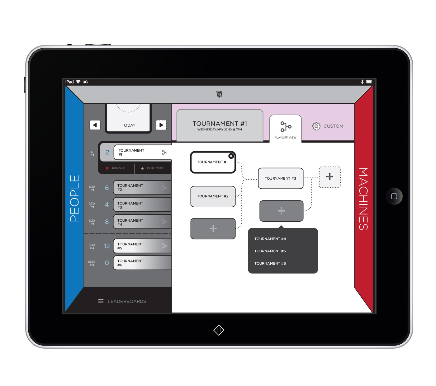
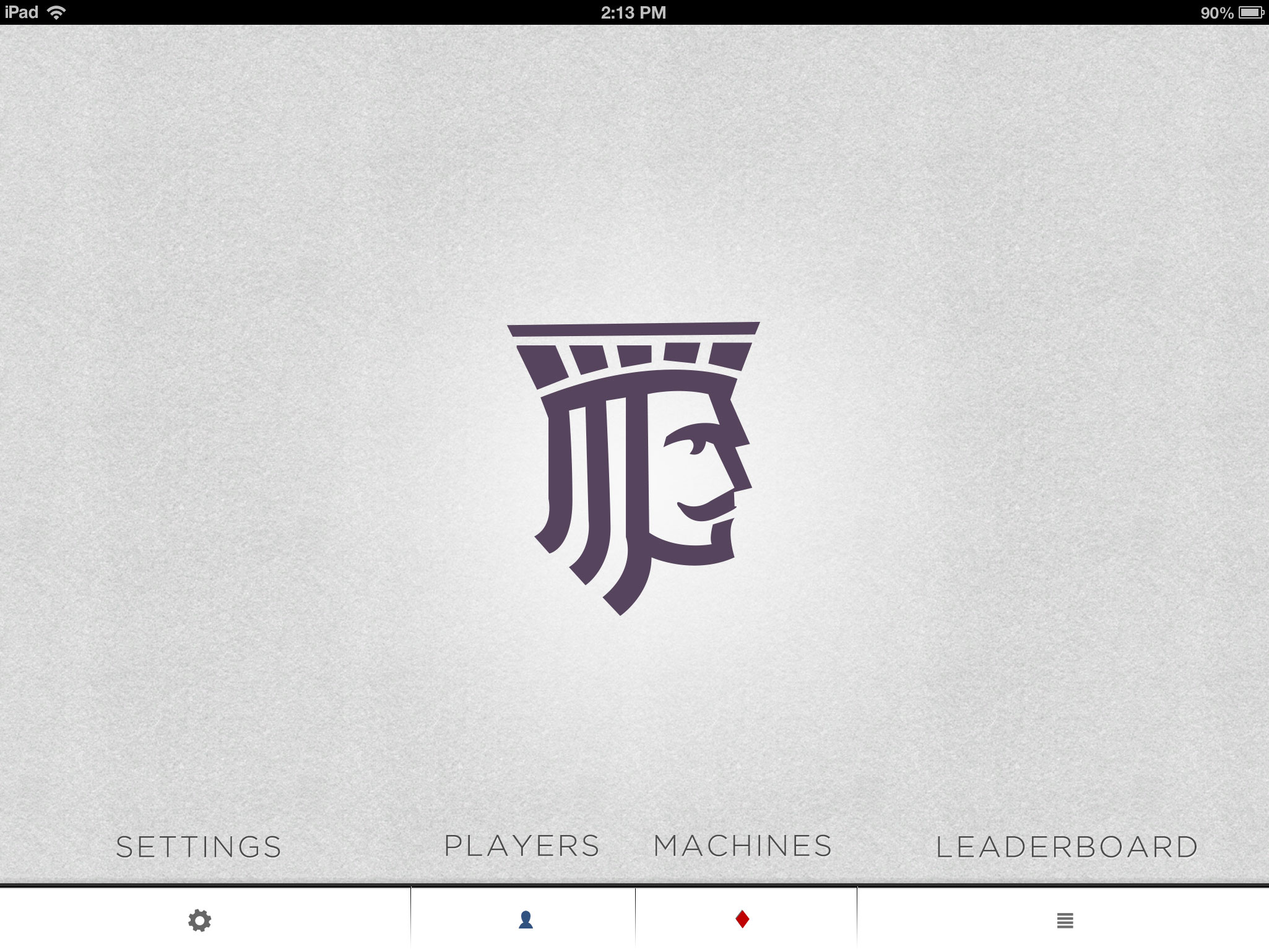
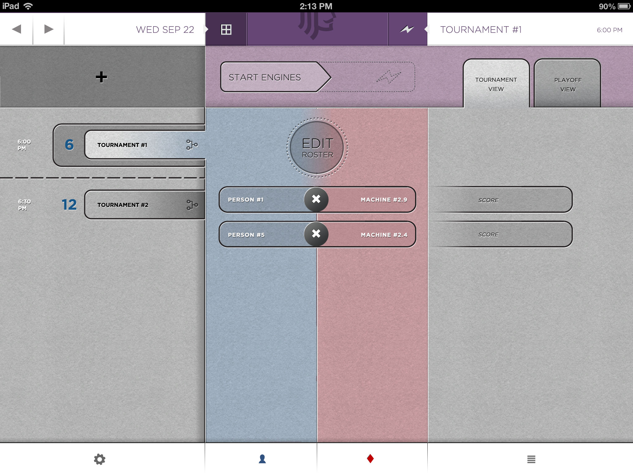
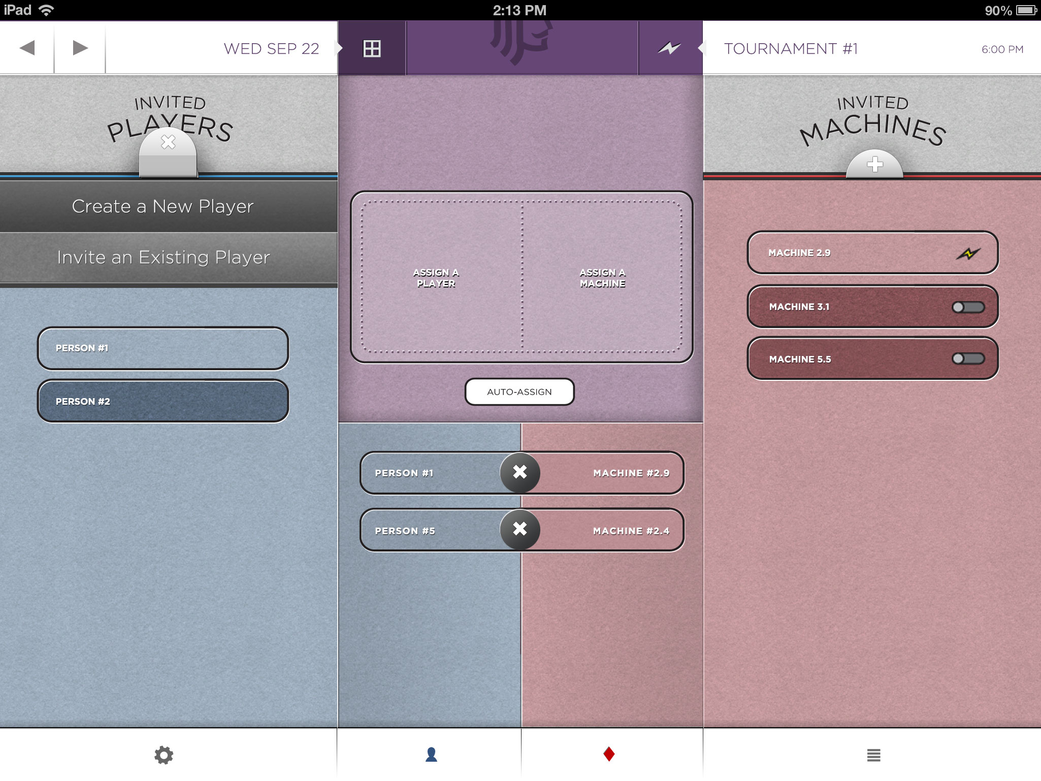
Another developer and I created an iPad app that would allow Casinos to manage their slot machine tournaments from the floor. Special attention was given to the operator responsible for signing up and managing large pools of players.
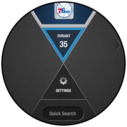
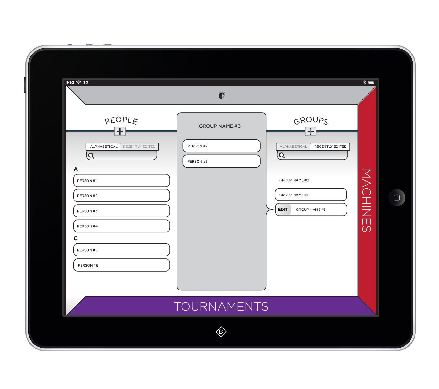
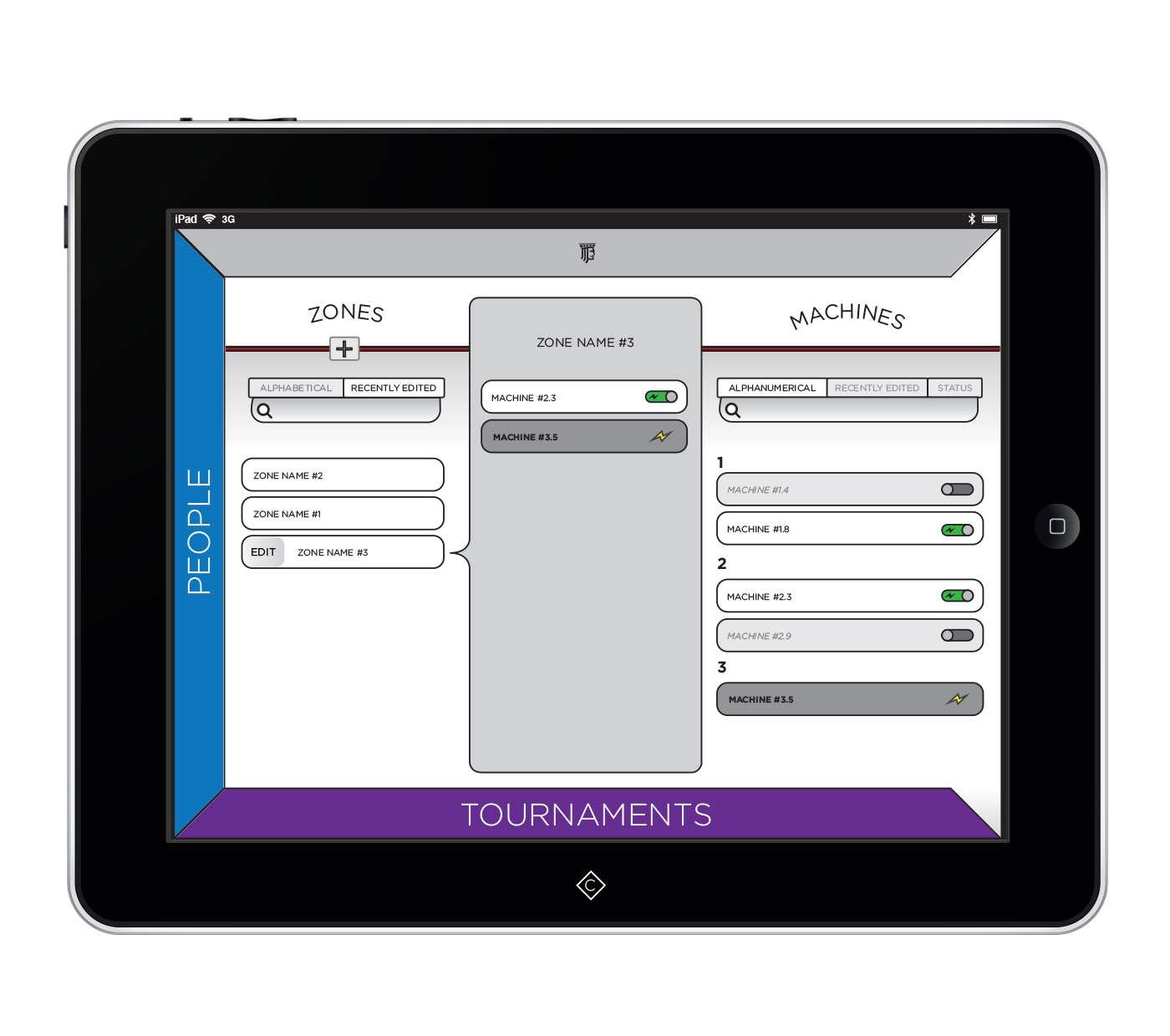
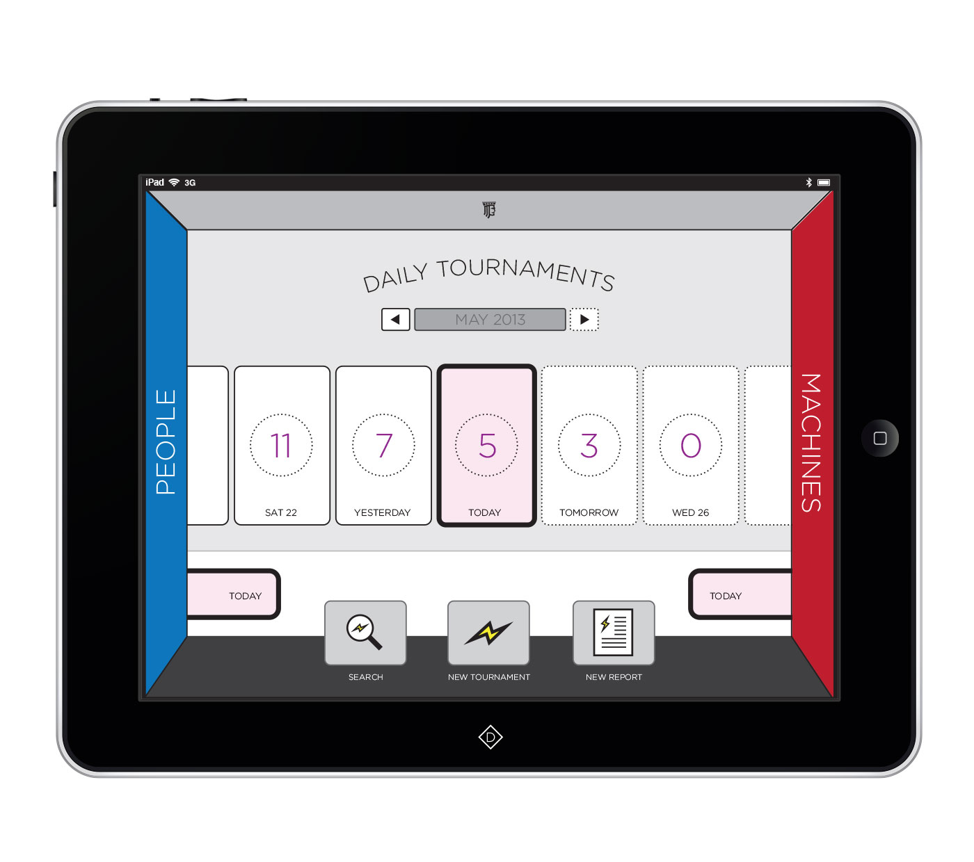
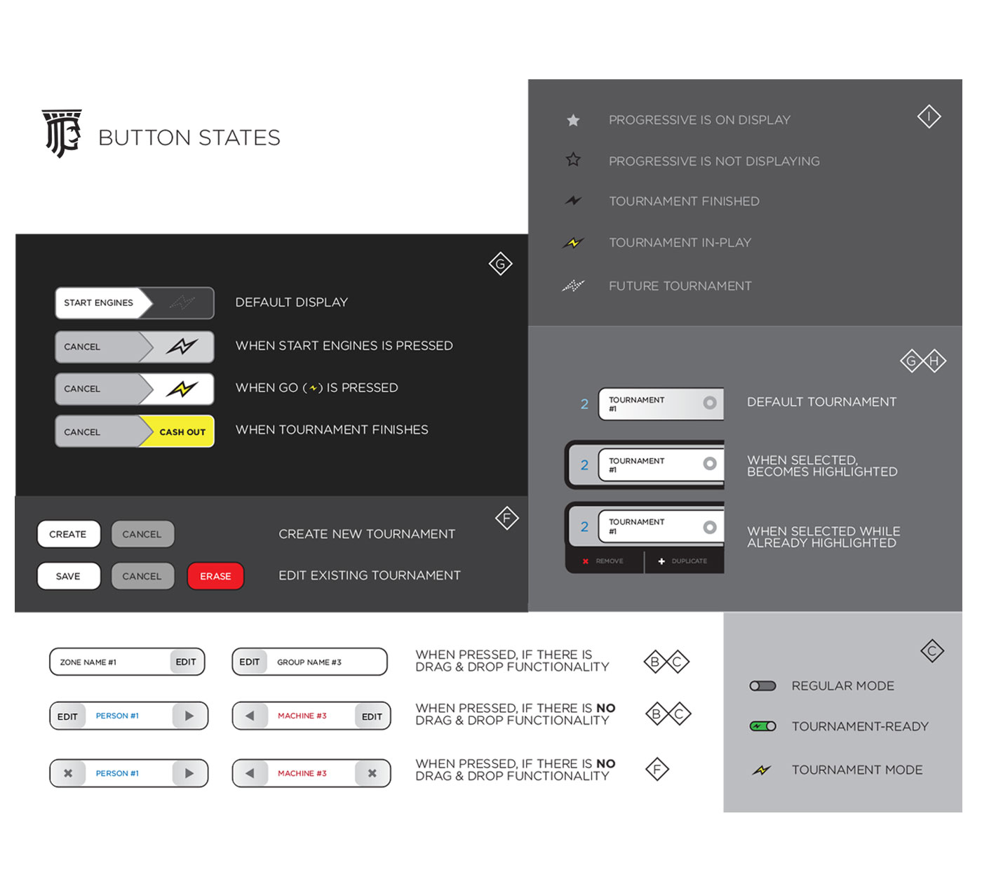
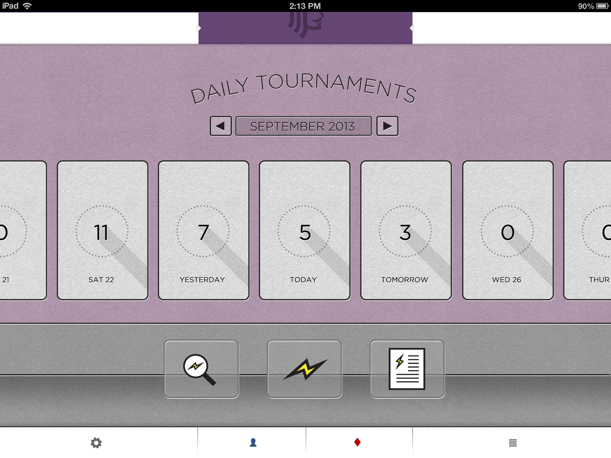
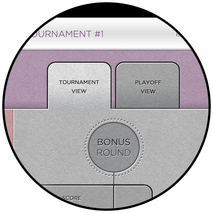
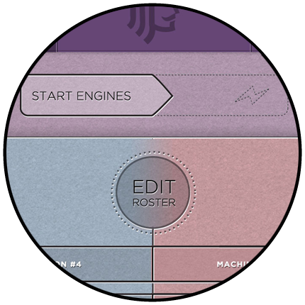
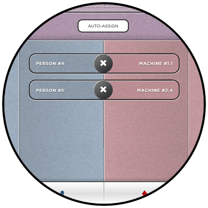
The color blue was given to everything player-related, the color red was given to everything machine-related. And since both players & machines would combine to form tournaments, the color purple is used to indicate everything tournament-related.
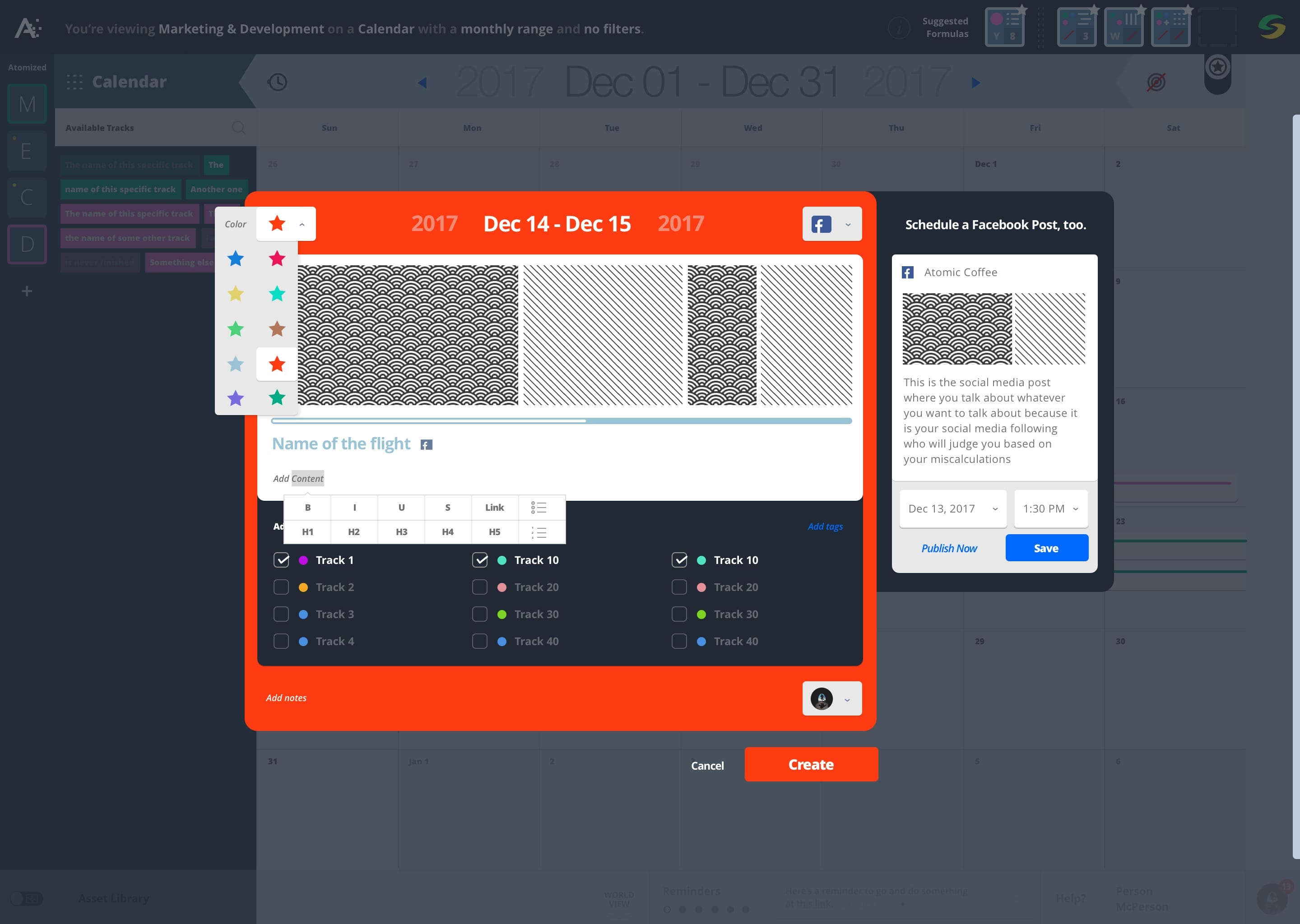
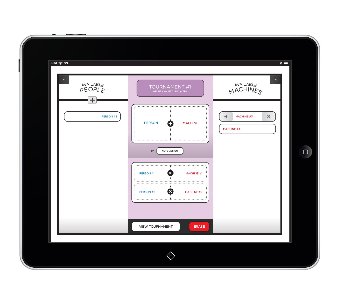
Another developer and I created an iPad app that would allow Casinos to manage their slot machine tournaments from the floor. Special attention was given to the operator responsible for signing up and managing large pools of players.
The color blue was given to everything player-related, the color red was given to everything machine-related. And since both players & machines would combine to form tournaments, the color purple is used to indicate everything tournament-related.
Slot Machine Tournament Director
Product Design for a Class II/III Gaming Company
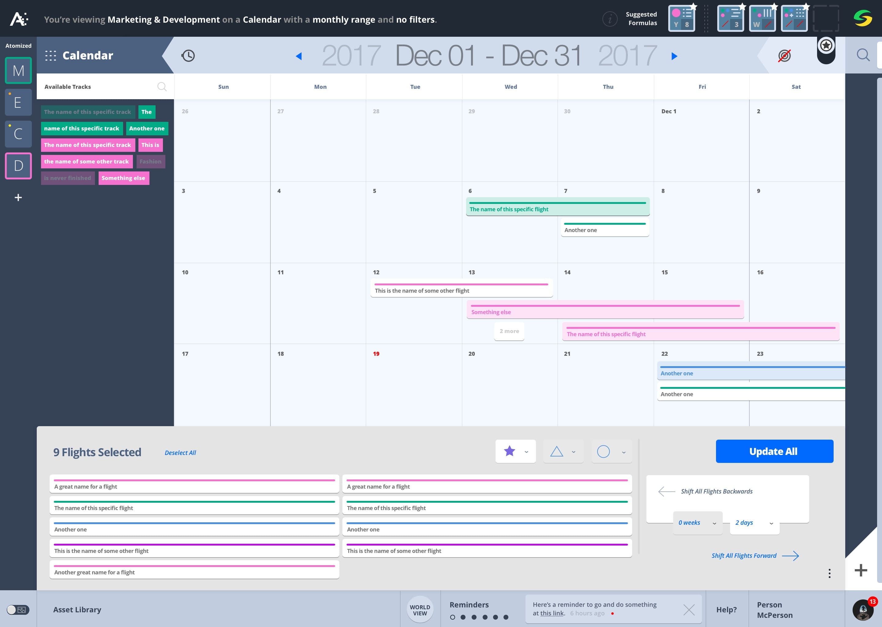
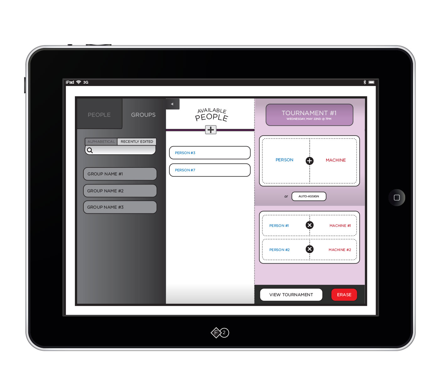
Another developer and I created an iPad app that would allow Casinos to manage their slot machine tournaments from the floor. Special attention was given to the operator responsible for signing up and managing large pools of players.
The color blue was given to everything player-related, the color red was given to everything machine-related. And since both players & machines would combine to form tournaments, the color purple is used to indicate everything tournament-related.
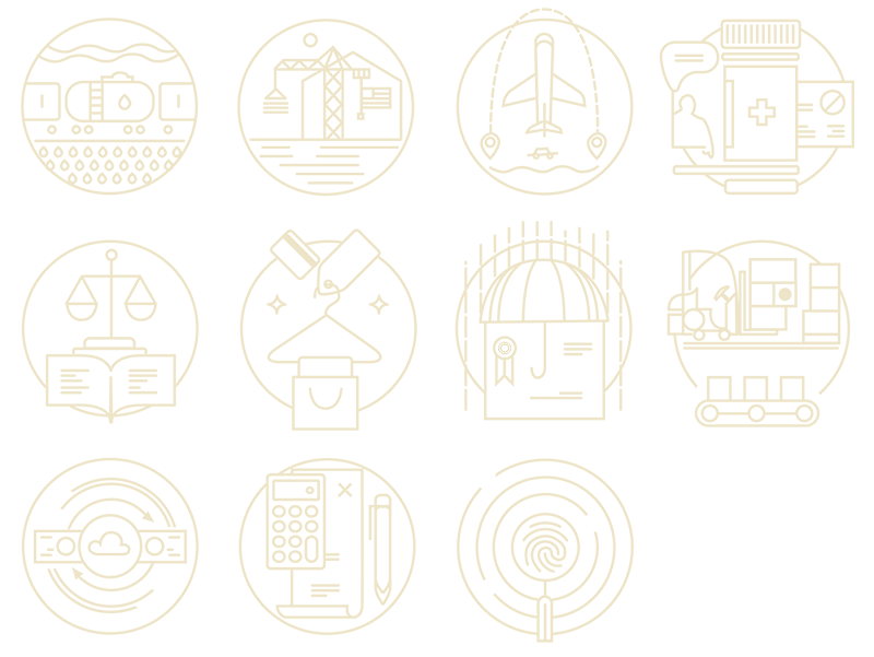
early wireframes
Try swiping left and right on the images to navigate.
Tap to Hide
Tap to load
1
2
3
4
5
6
7
8
9
10
11
12
13
14
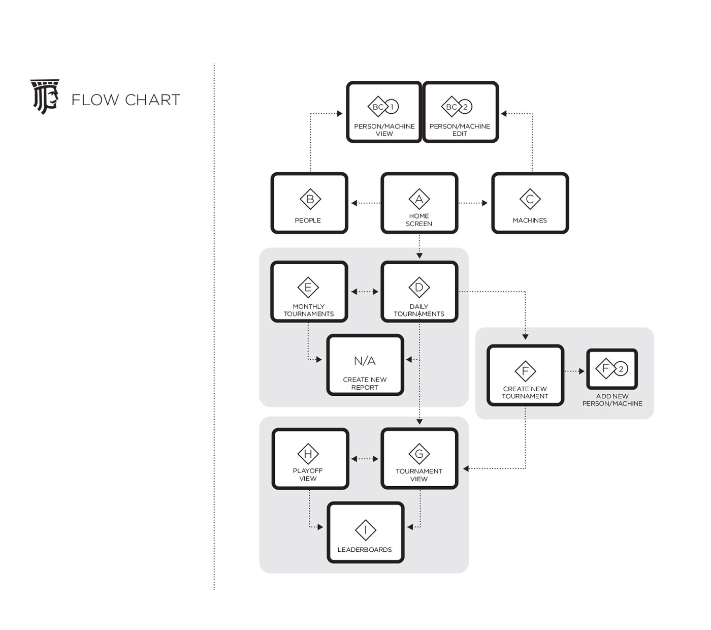
Flow Chart
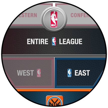
Home Screen
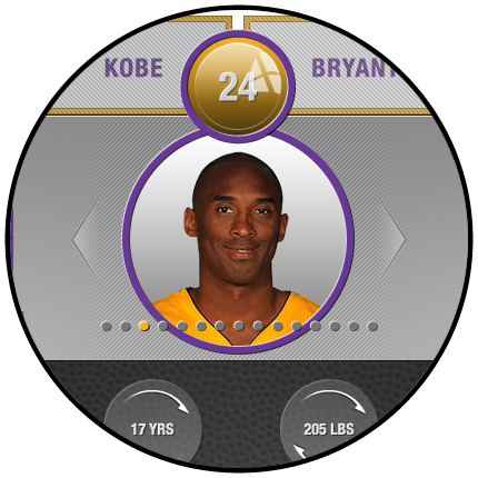
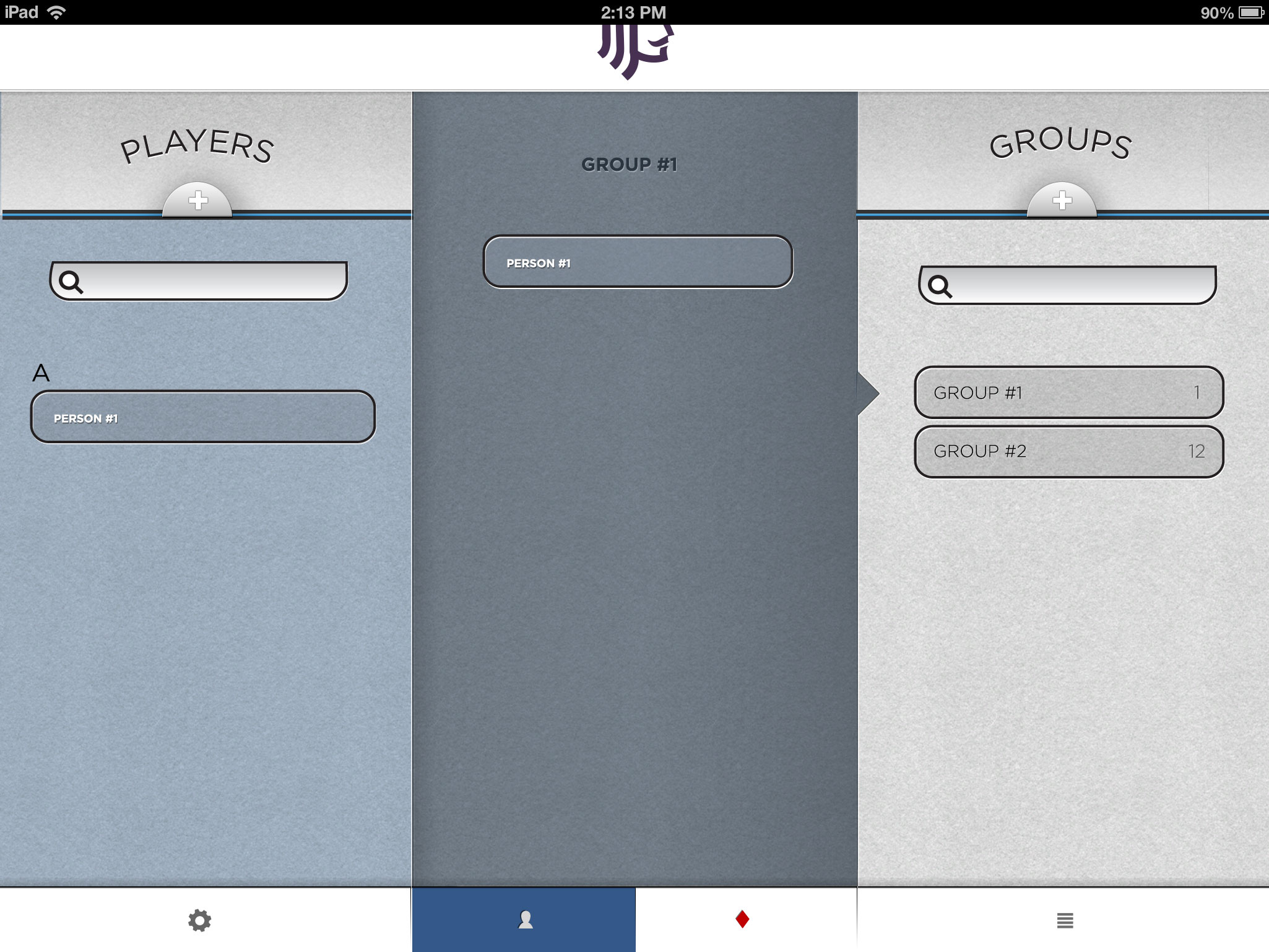
People
Machines
Daily Tournaments
Monthly Tournaments
Viewing Tournament Details
Adding People to the Tournament
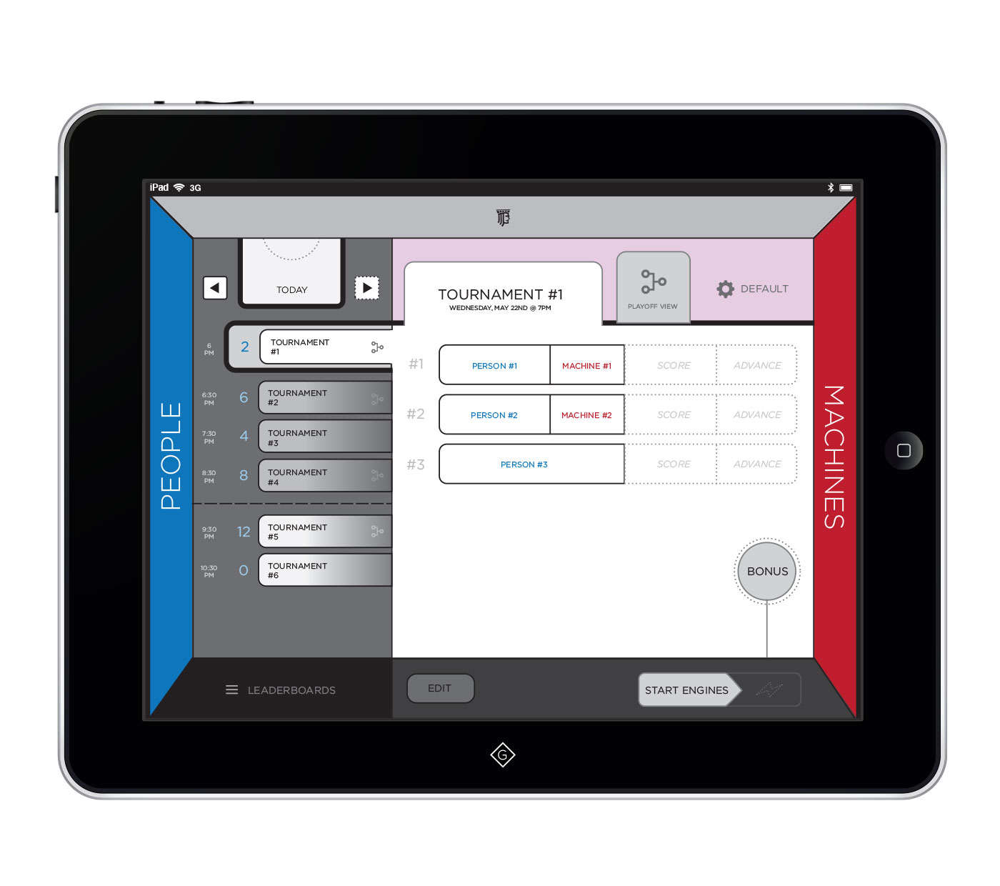
Viewing a Live Tournament
Playoff View
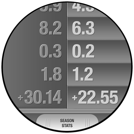
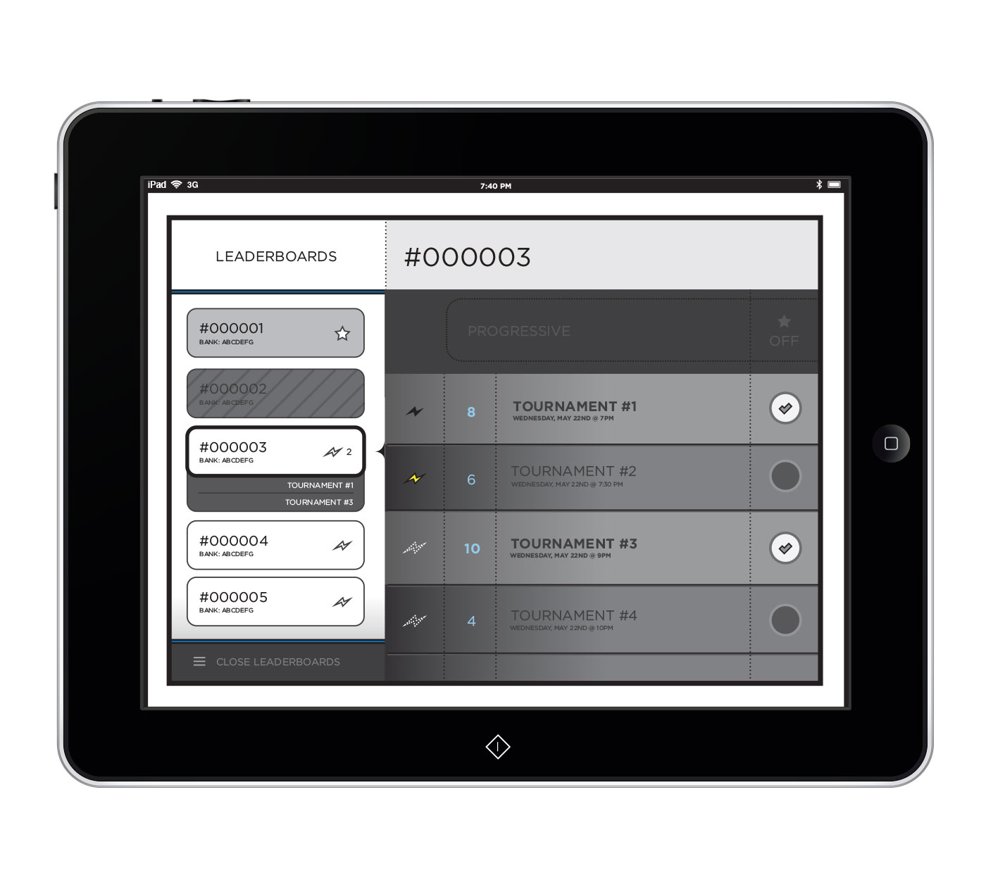
Leaderboards
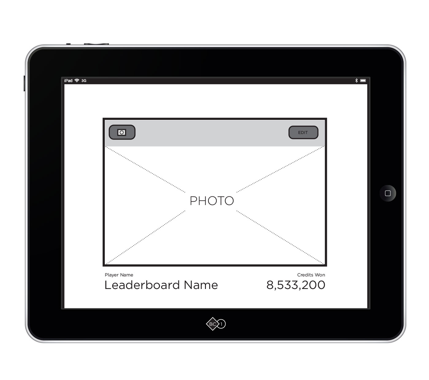
Leaderboard Detail
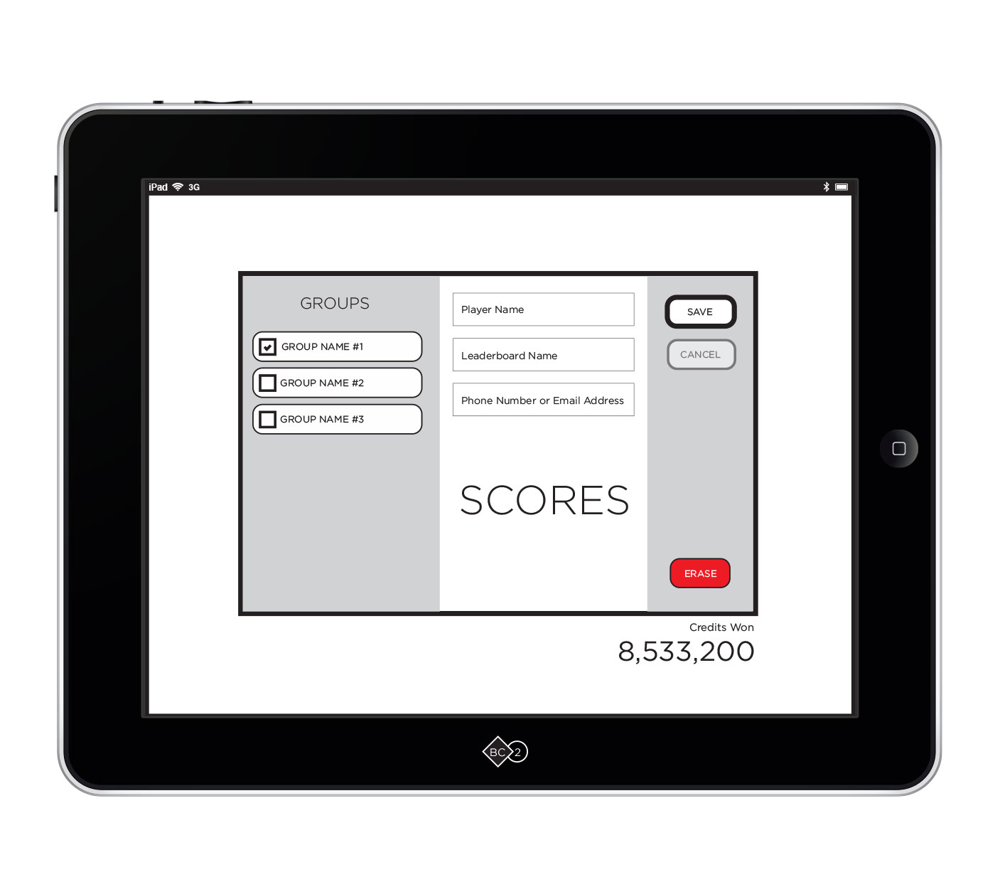
Leaderboard Detail: Edit
Various Button States
The navigation was reevaluated after testing with an initial pool of operators. The navigation around the edges felt to us like "easy access" in a loud, fast-paced environment, but instead was interpreted, not as links, but as descriptive labels for the content. The hierarchy was ambiguous.
Naturally, I felt that a better solution was out there and further exploration led to the changes seen below.
responsive tablet views
Overall, the interface would begin mimicking the subtle texture of felt, the kind found on tables in casinos.